I enjoyed Helvetica because it showed how well a given typeface can convey personality and identity to an audience. I really enjoyed its comparisons to other areas of art as well, like theater and music. During the opening of the movie, Massimo Vignelli compares the spaces between letters in typography to the spaces between notes in music.
Good typographers always have sensitivity about the spacing between the letters… In a sense it’s like music, it’s not the notes, it’s the spacing between the notes that really makes the music.
– Massimo Vignelli
As a musician, I agree with this statement because as musicians we are constantly thinking about the way we start and end our notes, which will affect the silence and space between the notes. I think this is a strong comparison that expresses well the way that typography can convey certain ideas or emotions. Later, Tobias Frere-Jones compared typography to casting an actor in a movie or TV show, alluding to the way that a typeface can really influence the way we perceive a message.
I think even if they’re not consciously aware of the typeface they’re reading, they’ll certainly be affected by it, the same way that an actor that’s miscast in a role will affect someone’s experience of a movie or play that they’re watching. They’ll still follow the plot, but, you know, be convinced or affected. I think typography is similar to that, where a designer choosing typefaces is essentially a casting director.
– Tobias Frere-Jones
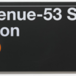
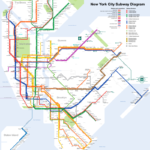
I found this comment to be spot-on, because we’ve definitely all seen a movie or TV show where the actor didn’t fit the role, but the plot was still easy to follow. His claim captures perfectly the way in which typography can really affect the viewer’s perception or take-away. Something else that I enjoyed most about the movie was that Helvetica was shown in a variety of contexts. Originally, I associated Helvetica only with New York City Subway signs, and I had no idea there were other companies using this typeface. Jonathan Hoefler expressed that Helvetica can say anything depending on what context it’s in, which is why it’s so versatile and widely used.
American Apparel uses Helvetica and it looks cheeky. American Airlines uses it, it looks silver… There’s something about the typeface that I think really invites this sort of open interpretation.
– Jonathan Hoefler
This comment resonates with me because I didn’t realize until watching this movie just how many contexts Helvetica is used in, and how many companies use it in their advertisements. My overall takeaway from this movie is that typography can largely affect the way the message is perceived by it’s viewers, and that Helvetica in particular is such a popular typeface because of it’s lack of personality; it’s simplicity allows it to take on whatever personality it needs to, based on whatever context it’s being used in.
Massimo Vignelli
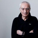
Massimo Vignelli was an Italian designer who has been heralded as one of the most prominent figures in graphic design. His designs are very modern in style, and he focused largely on simplicity and geometric forms. Massimo Vignelli was responsible for the New York City Subway map and signage.
Tobias Frere-Jones
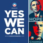
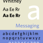
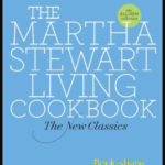
Tobais Frere-Jones is an American typeface designer who currently teaches at the Yale School of Art. He is responsible for designing the popular Gotham, Whitney, and Archer typefaces. His typefaces have been used by Barack Obama’s 2008 campaign, and Martha Stewart.

Jonathan Hoefler
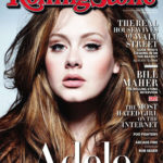
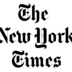
Jonathan Hoefler is an American typeface designer who has partnered in the past with Tobias Frere-Jones. Hoefler designed original typefaces for Rolling Stone magazine, New York Times Magazine, Sports Illustrated magazine, and more. He is well known for creating the Hoefler Text typeface, an old-style serif font that was used by Apple.