Introduction:
I enjoyed Helvetica because of how eye opening the film was. I did not realize how meaningful and in depth typeface was until watching this film. It broadened my understanding of fonts and their role in our everyday life.
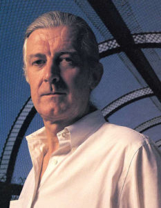
Massimo Vignelli:


“Visual disease is what we have around us and we try to cure it with design.”
This quote stuck out to me because of the metaphor and what it stands for. I like how it says we are surrounded by disease and that the attempt of curing it is design. Design is a very vast topic but it surrounds us everyday; so the impact it leaves on people varies from person to person. But one thing that is similar is that everyone can be cured by design, not necessarily the same kind but in some way it is possible. Just like how you have no idea of your affect on someone. But still try and leave a good impact.
Wim Crouwel:
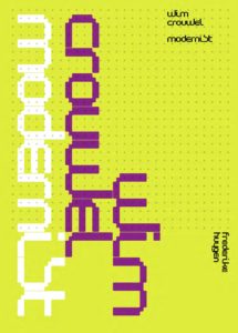
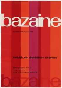
“Neutral shouldn’t have a meaning itself, more so a meaning of the context not the typeface.”
I liked this quote because it is saying that what really matters is the meaning of the words not how they are displayed. I related this to it is not how you look on the outside, rather who you are as a person and how you treat others. This quote meant a lot to me because I felt as if it was looking from a different perspective. It was showing how sometimes the typeface is not what is important but more what you receive and take in from the meaning of the words you read.
Matthew Carter:
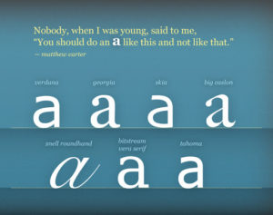

“The experiment of reading something is the test of how typeface performs.”
I also liked this quote because it is looking from the other side and saying that someone’s experience of reading something can/does depend of what typeface. I agree with this because depending on how it looks can definitely affect someones experience and the impact it has on them afterwards.