The McDonalds Font
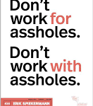
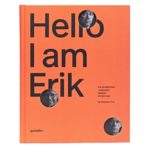
Right off the bat, I really like how the speakers described the simplicity of Helvetica. Erik Spiekermann said “It was like Most people who use Helvetica, use it because it’s ubiquitous. It’s like going to McDonald’s instead of thinking about food. Because it’s there, it’s on every street corner, so let’s eat crap because it’s on the corner.” It is everywhere, there are Mcdonalds everywhere. The video showed New York City, when you think about the city, it’s always busy, there are always things going on and people going somewhere, but there is a McDonalds that can be seen from almost all spots in the busy parts of the city. We don’t think about that. McDonalds is so common we almost done see it. This is the same with Helvetica, it is so common we don’t even notice the font when we see it. The link talks about Erik’s like and hi work as a graphic design artist and many of the things he has accomplished in his journey. He makes a great point, there are so many things around us that we don’t see. I think really stuck with me because I have been to New York so many times and I have never really seen most of what is right in front of my face. The McDonalds on the street corner.
The Design
I was reeling interested when Matthew Carter actually broke down how he creates a font, he starts with a lowercase h then moves on to a curvier letter. Building all the aspects of the font then as soon as possible getting it together. “ For me the experience of reading something is so critical.” The formation of words with the new font is the foal in seeing if it is a success or now. He continues to go over Helvetica and expresses that there is nothing wrong with the font, no improvements to be made. I have never thought about a font so in depth. Looking for the cut offs and the angles or each letter. Gauging clarity and vibe behind the actual font before it is put into words. Looking at the space in between each letter and the space that lives in a closed letter. This link reiterates the history of Helvetica and why it is so unique. I think it is really interesting that the definition of perfection in a font is simplicity.
Flying Under the Radar
Helvetica has been a standard since it took off after its design. I think it’s fascinating; all its uses and the relations people have had with it. Michael C. Place said “It’s that idea that some things designed to stand the test of time.” Helvetica certainly has. It was the font of the war and now it is the front of businesses and transportation, anything from airlines to clothes stores to tax returns are in Helvetica. This font is up for interpretation by the reader. It is so flexible and versatile that it can be used almost anywhere. It is a font that is designed to make you feel close to it and like you will fly under the radar. There was a great analogy about jeans, when you get a big, wild, choppy font, you expect ripped jeans, maybe biker jeans, something with a tough vibe. When you see jeans advertised in Helvetica, you are expecting American Eagle, Gap, or Urban Outfitters, something that will blend in because that is what the font does.
Not many things can be so simple and last so long. The perfection that is found in something that is so vastly used is incredible. This font has stood the tests of time and continues to grow in popularity around us; like McDonald’s in New York City.

