When living our day to day lives, fonts might not be on the fore front of our thoughts. When looking at signs, posters, advertising, and anything else that has text on it, we are seeing and processing the font of those written text. These fonts that we read and process have a subconscious way of communicating to us, and telling us a bit more about the words we are reading. Not many people notice, but there is one font that is used more than the rest. You can find this font printed on street signs, mail, and many brands such as Jeep, Toyota, JC Penny, Target, Oral-B and Skype. Now you may be thinking, these brands all have very different logo styles, and you’d be correct. While each brand has stylized this font differently to make their brand unique, the text has actually been derived from, you guessed it- Helvetica.
This week in class, we watched the documentary “Helvetica” directed and produced by Gary Hustwit. I had never seen this film before, and I had never really thought this deep into fonts either. Fonts were no more than a requirement on an essay to me, but after watching this film, I was able to think about text, fonts, and typography in an entirely new light. As an artist, I’ve experimented and explored with all different types of mediums, but never text. This film showed me a lot of insight into to power of text, specifically fonts, and how you stylize and allign them. I felt really drawn after watching this document to play around with finding different lettering and fonts that inspired me, and I got a few great new ideas for some art pieces that I can possibly store away for later in the semester. I really enjoy doing art in my spare time, but I definitly try to stick to simpler projects, and typography is something that really peaked my interest. Although when reading about the different types of graphic design last week, typography didn’t really spark my interested, this film redirected my opinion of text art in graphic design. This film definitely put a huge emphasis on the importance of fonts, and showed me a lot about how they influence is in living our lives.
below I have shared a few quotes from the documentary Helvetica.
Quotes
Massimo Vignilli
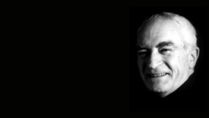
“Some people think text should be expressive, when they write dog they want it to bark.”
I enjoyed this quote because it gave me insight to the difference of opinion among graphic designers, because often times artists can find themselves sticking to what they think will be accepted by other artists, but this quote reminds us that with art, the beauty is in the eye of the beholder.
Michael Bureit

“It must’ve felt like you were dusting off something old, and replacing it with Helvetica.”
I loved this quote because along with the visuals of the old 50’s magazine fonts it perfectly delivered the message the documentary was trying to explain. I loved his explanation of this, because thats really exactly what it must’ve been like for people who lived during that time period and experience the shifting of the use of old big bubbly fonts, to a slim and sleek look like Helvetica.
Leslie

“The EPA uses it- now there’s someone who wants to look clean and efficient.”
I just loved this quote, my head perked right up when she said this, because she’s just so right. Helvetica certainly has a clean and modern look, and who better to represent that than the EPA. Not to mention the EPA using your font is huge bragging rights.