My Perspective
I never realized all the type design around me is majority Helvetica. The documentary opened my eyes since the film and now I see it everywhere. My perspective is that the best designers don’t like Helvetica and that they are trying to make their own typeface better, but the norm and default is Helvetica. I personally think they look different but I guess they are all Helvetica, limiting typefaces to other designers. Personally I like change and diversity and I feel that would be more attractive to the population.
Massimo Vignelli
“Its like the space between music, you need the white not the black”
I like this quote because for me the beats and the rests between words in the song are important to complete the overall message. Music and designs are similar conveying messages and you have to space it out correct to convey that message. Cant just put words or notes anymore, needs a reason to be there.
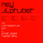
Wim Crouwel
“Clear, readable, and straight forward”
Me personally I am very plain, I like straight forward. I don’t like to look and find the message I want it clear to me. I don’t want it sloppy with an unclear message as well. This is the best designs for me if I was a consumer.
Erik Spiekermann
“Its the default, its the same as everything else”
Since everyone in this film hated Helvetica, they referred to it as the default. Even though I like plain and simple it’s still very important to the consumers to have a variety of different images and designs to convey the message.


