Who knew there was so many opinions surrounding a certain font? After watching Helvetica, directed by Gary Hustwit, 2007, I was shocked to hear so many designers with such a vocal opinion of one type design. Now that I’ve been exposed to the movie I see Helvetica font all over the world on signage and in designs. I am in the group of those who like the simple and basic design of this particular font. It was bizarre to me to see some designers express their major dislike for the font, and force themselves away from using it in any of their designs.
Leslie Savan
“Helvetica makes corporations seem useful and efficient, but also the smoothness of the letters makes them seem almost human…by using Helvetica that can come off seeming more accessible, transparent, and accountable.” – Leslie Savan

I like how Leslie comments on businesses and corporations benefiting from this font’s simplicity creating a transparency.

- Design by Leslie Savan

- Design by Leslie Savan

- Design by Leslie Savan
Erik Spiekerman

“The aim with type design is always to make it individual enough so that it’s interesting, but of course 95% of any alphabet has to look like the other alphabet otherwise you wouldn’t be able to read it.” – Eric Spiekermann
I like how Eric comments on the aim to make fonts unique, but he highlights that they are all very similar and it the very small details that sets them apart from one another.

- Eric Spiekermann Design

- Eric Spiekermann Design

- Eric Spiekermann Design
David Carson
“There’s a thin line between simple and clean and powerful, and simple and clean and boring.” – David Carson
I like how David’s comments are so aggressive in his dislike for using Helvetica. He goes way out of his way to create very interesting and unique designs and speaks vocally against the boring traditional designs.
-

- David Carson Designs
-
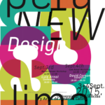
- David Carson Designs
-

- David Carson Designs