Everywhere you look you see typeface, probably one more than most and that is Helvetica. When it comes to thinking about one particular font, I never would have thought there is so much to say. The thing that stands out the most to me is how so many different people have opposing views of Helvetica. While some people love Helvetica for what it truly is, others would prefer to tweak the font in order to make something new and exciting out of it. I understand why some people don’t like to mess with the font; it flows very well and it’s definitely an eye-catcher. On the other hand, I do like the idea of taking the font and making it your own. It’s amazing to me how many places you can find Helvetica without even knowing, it’s subliminal in a sense. That being said, I think it deserves all of the attention it gets – it flows very nicely anywhere you see it, it’s clean, precise, and all-around one of the most sought after fonts.
Massimo Vignelli:

“It’s the space you put between the notes that makes the music.” – Massimo Vignelli
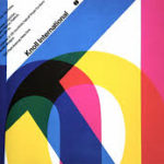
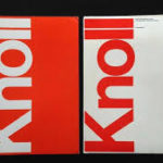
This quote to me makes a lot of sense, I like it. Vignelli loves Helvetica, he believes its one of only a few typefaces that should be used. In this quote, he is emphasizing how space is the big key when it comes to the font Helvetica. The main reason Vignelli is such a fan of Helvetica has something to do with how easily you can read and understand it. I couldn’t agree more that the font is clean and neat, especially as someone who enjoys being tidy.
Wim Crouwell:

“You can’t do better work with a computer but you can speed up your work enormously.” – Wim Crouwell
I could not agree more with this opinion of Crouwell. The reason I really liked this quote and could relate to it is because of my major, computer science. Working with computers every day makes you quickly understand how efficient they are and that is the point that he is trying to make. One of the things that Crouwell was into was using grids, he was interested in clarity and he felt the grids helped to achieve that. Again, his need for clarity and precision is something I can personally relate to as I tend to be a little OCD myself.
Paula Scher:

“Typography could have personality the way drawing did- I realized that type had spirit and could convey mood…” -Paula Scher
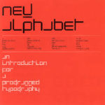
I liked this quote because it gave me a different perspective on typography. Scher was not a fan of Helvetica, she liked to give a font it’s own personality. Her main interests were magazines and album covers and she felt you can express all kinds of things when you let go of the press type. I chose Scher because it was a good example of an opposing view on Helvetica. It was intriguing to hear some of the negatives about Helvetica considering you either love it or hate it. I like what Sher has done with some of her work but overall I think I disagree and prefer the neatness of Helvetica.


