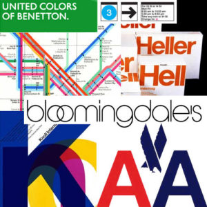
While watching Helvetica, I was surprised to see how passionate people were about a font as I had never thought of them as something other than an option on Microsoft word. It also surprised me how many different brands and companies use Helvetica and I had previously never noticed how much it surrounded us. Personally, I think that it is an overused font which takes away from the originality of the brands that use it. However I thought it was interesting how the font was created and how different artist felt about it. Some of the artist were very passionate about Helvetica and what it meant and how it changed the industry, personally I had never thought about it in this way so it was a very interesting perspective for me. The documentary portrayed different opinions about Helvetica in a way that allowed me to understand why each person felt the way they did which I thought was a very important aspect of the film.
David Carson

“Don’t confuse legibility with communication. Just because something is legible doesn’t mean it communicates and, more importantly, doesn’t mean it communicates the right thing.
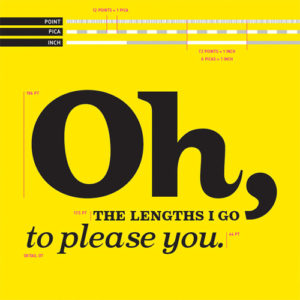
I chose this quote because a lot of the other artist talked about how simple and readable Helvetica is and I feel like even though it is easily readable, it doesn’t convey messages in a unique way. I think it is important no matter what you are doing, to first think about what you want to communicate and how you want to do so. This quote stuck out to me, because of the fact that I think a typeface needs to convey a message more than it needs to be simple and readable.

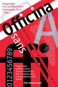
Erik Spierkermann
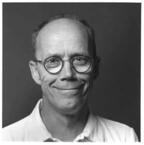
“A real typeface needs rhythm, needs contrast, it comes from handwriting, and that’s why I can read your handwriting, you can read mine. And I’m sure our handwriting is miles away from Helvetica or anything that would be considered legible, but we can read it, because there’s a rhythm to it, there’s a contrast to it. Helvetica hasn’t got *any* of that.”
This quote stood out to me, because it was interesting to see how he explained that a typeface needs to have more than just being legible or readable. I feel like a lot of the artist who personally preferred Helvetica liked it because it was readable and simple but I feel like there needs to be more to a type face other than just the fact that its readable, it has to be able to convey a message. This quote backed up my personal idea that you can’t convey every message using one font because it becomes boring, it no longer becomes interesting for people to look at.
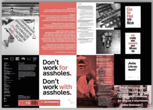
Massimo Vignelli
“There are people that think that type should be expressive. They have a different point of view from mine”
While I do not necessarily agree with Massimo’s views on Helvetica, I chose this quote because it really shows the difference in opinions of these artist. Contrary to the other two artist who’s quotes I used, he believe that type doesn’t need to be expressive and that Helvetica can convey whatever you’re trying to. This is interesting to me because I have always thought about it as different typefaces conveying different things rather than having one typeface that conveys everything.
![]()