I enjoyed Helvetica because it made me think about aspects of my surroundings that I don’t normally notice. Graphic design is everywhere. Based on this film, I can see that typeface plays a large role in how people feel about their surroundings, businesses, advertisements, etc. The concepts and opinions in the film were easy to understand and easily related to everyday life and other areas of study. I appreciated the fact that they used interviews with many different designers to develop a cohesive informational introduction into the history, use, and opinions on Helvetica.
Massimo Vignelli
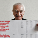
Good typographers always have sensitivity about the spacing between the letters… In a sense it’s like music, it’s not the notes, it’s the spacing between the notes that really makes the music.
~ Massimo Vignelli
I was happy to hear a statement that connected to music. As a musician myself, I completely agree with and understand the comparison he is making. It’s not just the letter, or note, that is important. It’s the “blank” space around it that can really help to develop character in a typeface, similar to how the spacing of notes in music can influence the way musicians play a piece and what characteristics their sound has. I think this is the case with many things in life; it’s not just one thing that influences or determines something. You have to look at the bigger picture and consider every variable.
Rick Poynor

After the horror and the cataclysm of the second world war, there’s a real feeling of idealism among some designers, many perhaps… that design is a part of that need to rebuild, to reconstruct, to make things more open, make them run more smoothly, be more democratic. There was this real sense of social responsibility among designers.
~ Rick Poynor
This statement makes a lot of sense to me. Although I wasn’t around during that period of time, I think we all experience points in our life where we need to rebuild. Things happen, and we have to pick up the pieces and create a comfortable environment to start to recover. This makes complete sense that people would feel that need after a war. I think as simple as it may seem on the surface, it’s a beautiful thing that designers had similar thoughts of idealism and responsibility to find a way to rebuild and recover after the tragedies of war.
Wim Crouwel


I’m always interested in clarity. It should be clear, it should be readable, it should be straightforward… That’s why I use grids… For me, it’s a tool of creating order, and creating order is typography.
~ Wim Crouwel
I agree with this viewpoint entirely, and I thought it was very neat that he is known for using grids to do his typography design. I also like for things to be clear, especially when taking notes. When I take or transfer notes onto my IPad, I specifically choose the grid paper design, that way I can make sure things are straight enough, and mostly uniform in size and spacing. When studying, reading, or even just flipping through a magazine, it’s important for things to be visually pleasing and clear so that the message isn’t lost in a struggle to get past poor design.