Helvetica and Didot
Among the five classic typefaces, my two favorites are Didot and Helvetica. I really like Didot because of its contrast between thick and thin lines, and I think upon first glance it’s a somewhat modern looking typeface. I enjoy Helvetica for the same reason, because it’s modern, however more simple. In my eyes, Didot is Helvetica with personality. That’s not to say that Helvetica lacks any interesting qualities. I like Helvetica in particular because its simplicity allows for the content it represents to speak louder than the actual typeface.
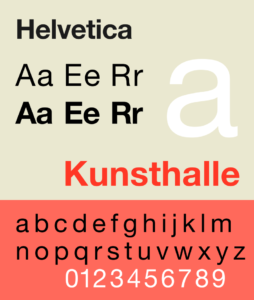
Helvetica
We’ve already had some exposure to Helvetica in class when we watched the Helvetica documentary, and it really surprised me how many companies use Helvetica, and how many different contexts it’s used in. I appreciate that it’s clean and simple and can take on the personality of what it’s representing; it’s a very versatile typeface in the graphic design world. Helvetica is a modern, sans-serif font, which originated in Switzerland in the 1950s. The apertures on the typeface are very consistent, specifically in lower case “e,” “c,” and “o.” The thickness of strokes is also very consistent, with only slight differences in the shoulders on the lowercase “r” and “h.” I think this type of consistency in different parts of the anatomy is what makes Helvetica so versatile.
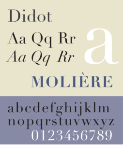
Didot
I enjoy Didot as well, because it’s somewhat modern looking, but also has an elegance to it. Didot originated in Paris, France, and it is considered a Modern, Serif font in the graphic design world. It was intended to heavily stress vertical lines and contrast between thick and thins. I like that Didot reads modern but also has that bit of elegance in the thin serifs. I definitely was not surprised when I learned that the typeface originated in France. Didot’s stems and x-height are very consistent, much like Helvetica, which I think is really characteristic of a “modern” typeface. I think the thickness of strokes and the serifs are what give Didot an elegance. The strokes gradually become thinner in areas, and the serifs are strictly thin, which contrasts with the thicker parts of the strokes.