Garamond & Didot
Throughout the Five Class Typefaces, I am more drawn to the curvature of Garamond and the simplicity of Didot. While typing up assignments and other work, I often found myself using Garamond type because it seemed similar to my own handwriting and also incorporated more of a curved style than some others. Although Garamond is my go-to typeface, recently being introduced Didot, I was instantly drawn to the simple yet captivating linework of the type. Both of these fonts have serifs yet their serifs are different. Garamond has more defined serifs that have terminals and thicker brackets than Didot. Whereas Didot does not have terminals and has much thinner brackets and shoulders.
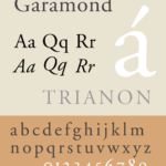
Garamond
Garamond is considered an Old Style serif font in the graphic design world, which originated in France. This typeface is considered Old Style because of the contrast between the thick and thin lines and heavy brackets in the serifs. Although it may not be very easy to notice, the ascendents of the lower case letters are taller than the capital letters. The overall font is round and open, making this font very easy to read and also appealing to one’s eye. My own handwriting has been referred to as round and bubbly which is part of the reason I am drawn to this font.
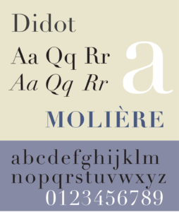
Didot
Didot is considered to be a Modern serif font in the graphic design world, although it originated from Paris, France. While Didot does have serifs, the font itself focuses more on the vertical lines rather than the curvature of the letters. Although this font is considered modern, I think that it has an unspoken elegance about it, which makes sense since it was developed in Paris. This font could be seen as Old Style, however, the contrast between the thicks and thins, the unbracketed serifs, and the strong stresses on the vertical lines. The simplicity and the stress on the vertical lines are what draw me to this typeface.