Garamond & Century
The Garamond and century typeface are the two that catch my eye out of the five listed. Garamond has a sense of greatness or adventure, it looks as though it’s about to tell an epic story. The width between the letters, accented by its ancient looking serifs never gets old. Century on the other hand looks more formal, and sharp with its heavy angles. Having been made much later than Garamond, Century feels like a more modern adaptation. The stems are squished vertically, making them appear pointy, while Garamond’s serifs are squished horizontally.
Garamond
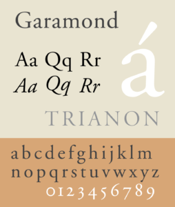
Garamond is a classic typeface, named after Claude Garamond who was originally credited for making it. Later it was discovered that a man named Jean Jannon, in 1615. Regardless of the confusion for who made it, universally the name has remained Garamond. The stems and hairlines have little difference in thickness, while the serifs are elongated, giving it a clean and readable presence. It’s also an interesting detail to note that the ascenders of the lowercase letters, reach taller than the height of the uppercase letters. I think the attention to detail, and character is what makes Garamond an interesting typeface.
Century
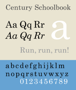
Century was originally created in 1894 for the Century Magazine, inspired by Egyptian style typeface. A similarity Century has with Garamond is that it shares a lack of difference for thins, and thickness. What grabs my attention when I look at this text are the slab serifs used on each characters. It grounds the text making it feel balanced, and prominent. Additionally, Century shares a tall x-height similar to Garamond’s. The similarities between the two show how successful, and legible these fonts have become.