Classic Typeface/Anatomy
Baskerville was created by an Englishman in 1757 and Century is considered to be the first major American typeface created in 1894. Since both are hundreds of years old they bring the old modern look into it and with newer edits done by designers they both have newer style writing with old modern brackets, better use with thick and thin lines. Baskerville lowercase letters seem very close to Helvetica and easy to read, than when its uppercase it has an old/modern style that I like, has the brackets on the end of each letter, bringing uniqueness. Century is similar to Baskerville with the brackets at the end of each letter, but unlike Baskerville the lowercase and uppercase has the brackets for century. Both typefaces uses thick and thin lines to create the letter for better contrast, making both typefaces very readable and appealing.
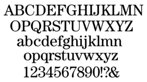
Baskerville
Baskerville is an example of the transitional typeface, this means that have both old and modern style within each letter. The letters show better contrast with thick and thin lines. The serifs are less bracketed, but my vertical, bringing old and modern into it. Capital letters seem to be much bigger and bolder than lowercase letters, making this seem a bit odd to me, like its two different fonts.
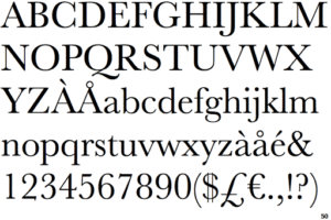
Century
Century again is considered the first major American typeface, the use of thick main strokes with thin contrasts. Before century it was called Egyptian, or slab serif typeface. This changed as newer designers tweaked and typeface. Letters are typically larger and bolder to make typeface very legible.