Century and Helvetica:
I chose Century and Helvetica out of the five typefaces because one can be able to compare and contrast between the two. In my opinion, I enjoy Century because it has added strokes in texts. Personally, I think Helvetica has a more modernized text than what Century has because of its delicacy of no ears or even ligature. Helvetica is simple, but I feel relieved and calmed down at its fine strokes in its texts. Century and Helvetica share some of the anatomy like uppercase, lowercase, and large x-height. However, there is differences between the two. The Century typeface has ears that makes just an extra stroke that helps prints stand out while the Helvetica typeface has its diagonal strokes that make very simple but fine marks. Both Helvetica and Century share similarities but are often different. Although, it makes them appear unique when contrasting between the two.
Century:
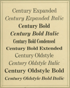
Century was designed by Linn Boyd Benton and it was originally made for Theodore Lowe DeVinne, the printer of The Century Magazine. In 1815, Egyptian typestyle came out before Century. With its thick slab serifs and thick main strokes, the Egyptian style helped characterize Century Expanded today. Linn Boyd Benton created large x-height and simple form to make the Century Expanded typeface easier to read. The Century typeface got picked up from an older use of style, but continues to stand unique from others with its thick serifs and strokes in texts.
Helvetica:
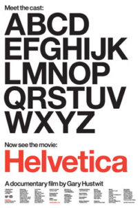
The Helvetica typeface first originated from Switzerland. In the nineteenth century, typefaces were used without serifs, but that was only true until the twentieth century. Helvetica was originally named Haas Grotesk, developed by Max Miedinger. Like the Century Expanded typeface, Helvetica has large x-heights and is very readable. What makes Helvetica stand out from other typefaces is its clean design and equal strokes.