Garamond & Didot
These are the fonts that stuck out to me on the list and for the figure ground project we had to do. They are both very visually pleasing fonts. Garamond has a fascinating width between the letters which makes it look important and official. Where as Didot is more clean cut and narrow with thing serifs making it appear as a clean formal font as it is a much more modern font than Garamond.
Didot
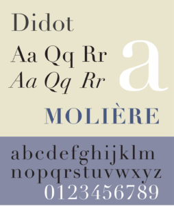
Didot is a modern typeface, named after the famous French painting and the type producing family. This font has a strong contrast between the thicks and thins which makes it a very elegant font. The thin semis and strong vertical stress are all what makes this a modern typeface. Didot conveys a sense of elegance that many typefaces have a hard typing conveying.
Garamond
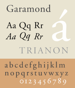
This is an old serif styled typeface that was the first to deviate from a handwritten style in order for it to be more readable in printing. Claude Garamond was originally credited with creating this typeface, but it was later found that Jean Jannon also had a part in designing this type face. There is very little difference between the thicks and thins of the font. This font is very clear and expressive which makes it so important in its use.