Helvetica & Didot
These two fonts stuck out to me because of there simplicity. For me personally, I like Helvetica the most out of all the fonts because of its simplicity and its ability to be straightforward and direct. Helvetica has a very simple and clean look to it. It doesn’t have any bars on the bottom and its bold and very easy to read. Since, I think I’m a simplistic person, the font with the simplest format, makes the most sense to me. The reason why I choose Didot is because, for me its the second cleanest font of the four. It’s elegant, clean and fancy. I like how it’s fancy but not too excessive to where it’s too much.
Helvetica

Helvetica was developed by a Swiss designer in 1957. It is the most used font for designers to this day. The reason for this is because of its simplicity and legibility.
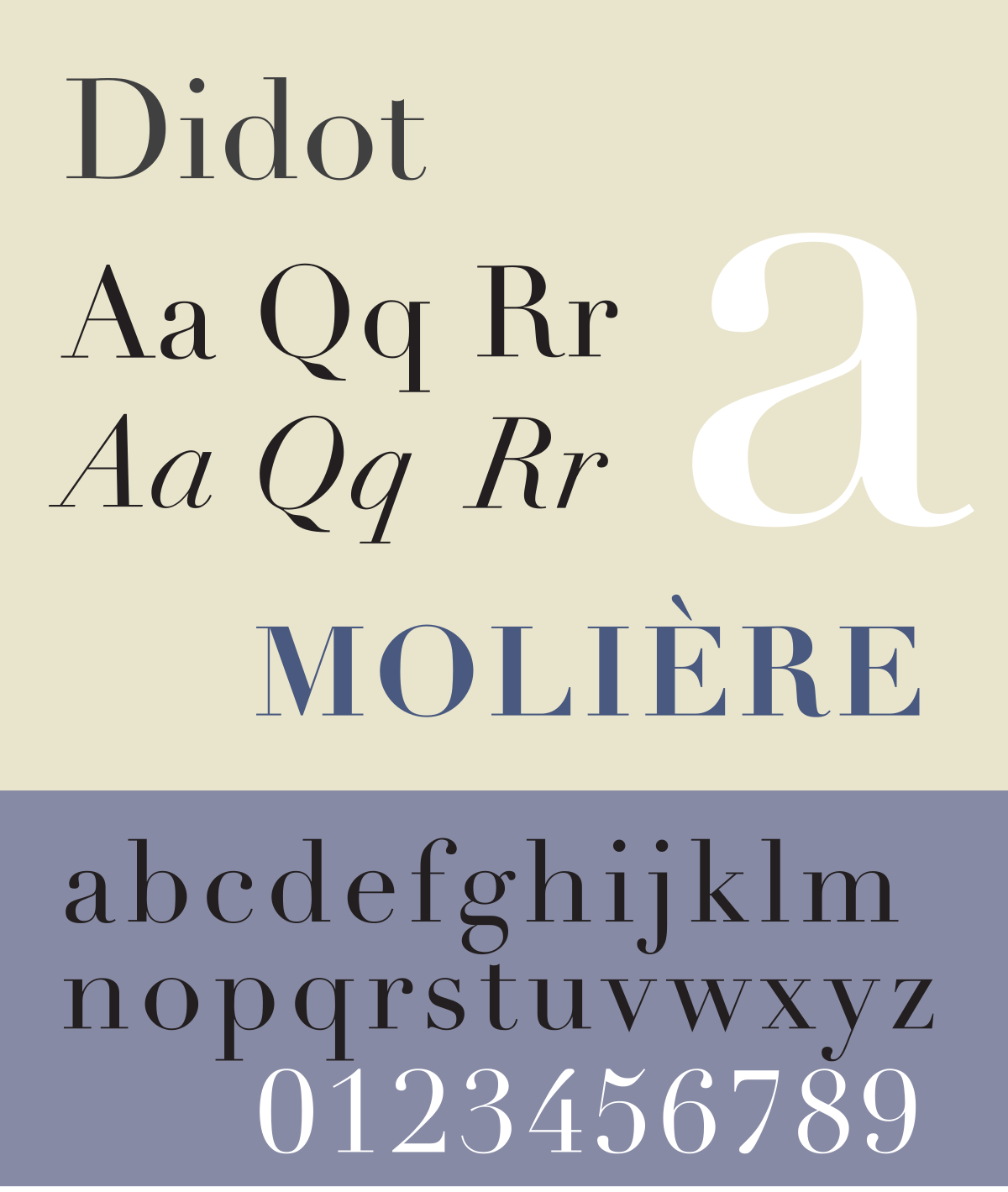
Didot is a thin and modern/fancy typeface. It was named after the French painting and the type producing family. It’s a very elegant font which makes it a very strong and meaningful font.