6 Design Types
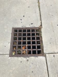
Unity/Rhythm: This sewer drain consists of small squares inside a large square, but they are all the same size and shape. They are all evenly spread out making it rhythm, but all the squares come together to create unity in the picture.
Emphasis: This shows lots of emphasis especially during these times that you need to wear your mask, the use of Hootie wearing a mask, meaning that everyone needs a mask at this time.

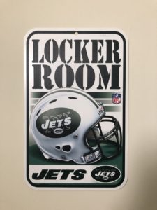
White Space: The white space in this picture doesn’t show another object, but it brings out and emphasizes the logo and color of the team. Brings out the bold letters and the NFL helmet to make it stand out more. The white space really makes it critical to make this poster emphasize the team and very readable to the audience.
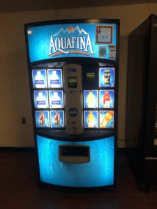
Variety: A vending machine shows great variety, has great selection of favorite drinks. But it shares similar sizes/ounces, but all the brands are different. All comes together to have a selection of your favorite drink.
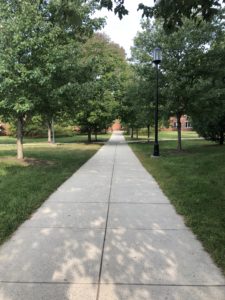
Movement: I am moving in the picture, but you get the sense that I’m walking back to my dorm room, the trees and the path show direction and just how nice our campus is.The path guides your eyes to the destination, catches the eye to show movement.
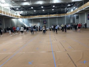
Repetition: Students patiently waiting in line for their Covid test. They are repeated by equally spreading out each student 6 feet apart with those lines and all standing on the blue crosses.
Gestalt Theory
Gestalt theory is based on pattern, figure, form or structure that is unified. Gestalt psychologists found that these principles try to explain when and how our minds perceive different visual components in a small group. The first principle is simplicity, we tend to see things as simple as possible first, like for example words and pictures combined to show a picture made from words. We see and understand it very quickly. Second is figure-ground, we have already experienced and worked with this in class but the ground makes the figure stand out much more, my favorite type of design so far. Third is proximity, little same shapes put together m=to make an image, our eyes perceive these very quickly. Fourth is similarity, we group shapes and colors very quickly with our eyes and spot the images or designs created within. Fifth is common fate, we see 2D images and create a 3D image from them. Sixth is symmetry, probably in my option the easiest to perceive with the human eye, we place and react to symmetry first. Seventh is continuity, even if designs bleed off the page we still see the picture in our mind continuing even though we can’t see it. closure, the way we spot objects that aren’t in the photo. Common region, we see many different characters in Disney on one photo so we group them together and understand this image/design is for Disney even though it doesn’t say it. lastly element connectedness to combine a bunch or different elements to create one big image with lots of details.