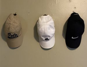
Repetition:
I chose this photo for repetition because the hats are lined up in a row. They are all the same type of hat yet different brands and different colors but this still shows a form of repetition since they are equally aligned.
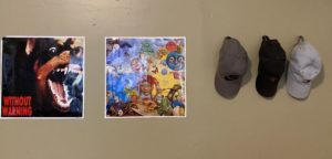
Balance:
I chose this photo for balance because these posters and hats are all similarily aligned with one another. I feel as though the two posters take up about as much surface area as the hats do. This photo has a sense of equilibrium which is why I chose balance for this photo.
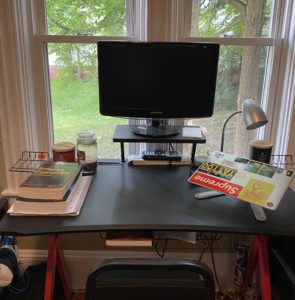
Contrast:
I chose this photo for contrast because I feel like the centerpiece of this desk and what draws your attention the most is the monit0r. Not only is the monitor centered but it is also elevated and takes up a large amount of space compared to the rest of the desk.
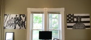
Unity:
I chose this photo for unity because the two posters on each side of the window are symmetrical. There is definitely a visual similarity between these two posters; their the same size, same colors, and both have to do with a singular rap artist.
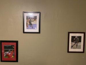
White Space:
I chose this photo to represent white space because of the way these picture frames are spread. All of the space in between these frames is considered the white space. In this situation, the white space is used to spread these framed photos in a way that emphasizes them.
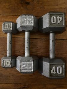
Proportion:
I chose this photo to represent the proportion principle because theirs a relationship between these three items; they are all silver weights. The main aspect here that makes this a representation of proportion is the difference in the size of these weights.