This week we read and learned about 11 principals of graphic design, today I have chosen 6 of those principals to talk about. The 6 principals I felt were the most vital are Unity, Variety, Contrast, Rhythm, Movement, Balance. I chose these principals because I am familiar with using these concepts within my own art and design. I use these principals in my own art because of the way these principals can compliment each other when used correctly within design.The Gestalt Theory is the concept of certain aspects of design including simplicity, proximity, similarity, symmetry, continuity, closure, and connectedness to create a unified piece that is visually pleasing to a viewer. In my opinion I think the Gestalt theory was correct in its theorization of what aspects makes a visually pleasing design that people will remember. The 6 concepts I have chosen to talk about are similar to those mentioned in the Gestalt theory because they are concepts that allow a viewer an open interpretation of the design.
This week I tried to notice graphic designs that incorporated these principals around my home, stores, and other places around keene to inspire me to create my own examples of these 6 principals with my favorite colors and I’m really happy with how they came out.
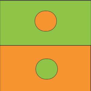
Unity

Unity in design means creating a sense of visual similarity between different elements in a composition. I enjoy unity within graphic design because it makes a piece easily digestible and overall pleasing to the eye. The visual similarity gives the viewer a sense of comfort.
Variety

Variety means adding a change to disrupt the monotony of a composition. I chose Variety because adding variety can take a bland design, and make it interesting. Variety within a design gives a viewer a bit more to look at than just a basic design.
Contrast
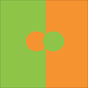
Contrast occurs when elements in composition have vastly different properties such as color, size, shape, etc. Contrast within design provides multi layered visual aspects that engages the viewer. Contrast in design is a fun way to emphasize or disguise certain parts of the design. Contrast is interesting to work with because it allows an artist more expression, and the ability to guide an audience through a story.
Rhythm

To create a rhythm in design, an object needs to have varying distances between several frequencies. Rhythm is my absolute favorite principal design and perhaps the one I use the most in my day to day life. Rhythm within a piece creates a sense of excitement and vibrancy for the viewer and allows them to read a design openly. We use rhythm in our lives when we sing, choreograph, and write. When decorating my home and placing photographs on the wall, I use rhythm to space out my art in a way that I find visually stimulating. Rhythm is a universal principal that is openly interpreted by everyone, thats why it makes it so fun to work with in design.
Movement

Movement in design is the concept of guiding the user’s eye to a predetermined path in a composition. Movement within graphic design can become an awesome component that gives more life, and energy to a piece. Movement is a great way of telling a story, by allowing the viewers eye to follow the design where you intend it too.
Balance
Balance in design includes mono-symmetric and multi-symmetric aspects and can create a very peaceful feeling for the viewer. Balance is a fun principal to work with because it can feel very relaxing to organize design in a way that is balanced. Balance gives the viewer a calming sense of peace, in contrast to say tension which might be designed to make the viewer feel discomfort.