PRINCIPALS OF DESIGN
MOVEMENT
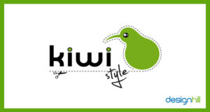
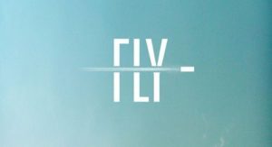
Movement in logo design helps a viewer run their eye across the work. The dotted lines with scissors make me want to run my eyes across the Kiwi logo and around the bird. The object shown moving through the FLY logo makes it interesting to me, capturing movement, yet very simple.
BALANCE
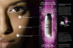
Balance is shown in the above AD by placing the females face on one side of the L’oreal Ad, and balancing the weight of the shape of the product bottle and typeface lettering blocks across the page. The balance on the page makes a slick and professional looking advertisement.
UNITY
![]()
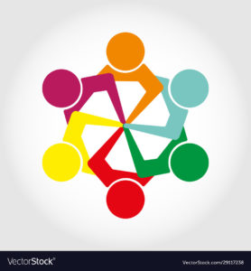
Unity is a simple way to create logos using repetitive similar shapes to create a design. IBM uses a series of lines to create their lettering which is one of the most iconic logos still uses today. So simple but very effective.
SCALE

Scale is a very effective way to design. The use of very large or very small parts of a design allows the artist to reinforce the important part of the message, or emphasize a particular important of the design. In the insurance design, the large scales quickly indicate they are involved in legal proceedings, combined with the lettering accident I already know what the company does before reading all the information.
WHITE SPACE
Using negative white space to create two different images is a very cool way to make your design interesting. People love looking at this type of art and when done properly makes a viewers spend more time inspecting your ad.
RHYTHM
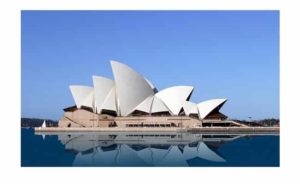
Using similar shapes or concepts to create a unique design is one of my favorite concepts. In the above picture the Sydney Opera house design is made up of similar triangle shapes placed together to make one of the most well known rhythmic building designs in history. Just the way the shapes are formed together gives the building a edgy and elegant feeling, it tells me the most elite musicians play inside that building.
GESTALT THEORY
After reading about the psychological elements at play in design it has me thinking about many of the design I like and why. Using the natural responses of the brain the get a reaction is very interesting to me, and adds some excitement into design. My favorite example is the Closure example of the World Wild Life’s Panda Logo, which leaves some space excluded and your mind fills in the shape of the bear. There are so many possibilities to include a message hidden into your design. The other examples I find interesting are proximity and parallelism(especially in typeface designs), which I have been including into some of the designs I have made without knowing the psychology behind the techniques. I have a natural taste for Helvetica type designs, but these other Gestalt Theory techniques make me want to start trying to incorporate different styles into my work.