6 Principles of Design Examples:
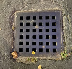
Unity: Unity is composed with different elements in a design that forms visual similarity. This picture represents unity because it creates supportive elements that brings a sense of unison. Just like your everyday sewer drain, the little squares of holes that make up the drain are the same size and shape, showing repetition, and balance and alignment.
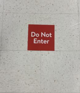
White Space: White space shows empty space in a design. Negative space is used to emphasize an object to create a simple but focused composition. In this photo, the red square that states “Do Not Enter” is in fact a focused object of attention in this composition of white space. It has empty space that can bring out the red square in the design.

Contrast: Contrast in a composition shows elements that have different sizes, colors, shapes and many more properties at first glance. The object of the photo must be focused and emphasized, and there must be a visual difference between the elements. The building is the object focused in the picture because of the dark blue, night sky.

Emphasis: Emphasis in a design contains only one specific area that should bring out an object of importance. By using some of the 11 principles of design; contrast, scale, white space, and movement, you can be able to create a design that shows emphasis. For example, this photo contains light in a certain area that makes the grass greener.

Movement: In this image, movement is represented. In a design that expresses movement, the focus must show an illusion that guides the readers eyes to a path of direction. As used in this photo, the focus of only the road shows movement as a skateboarder in the background faintly passes by. The grass is blurred, making the illusion that we are only looking at the pavement and that our eyes are immediately heading into one direction.

Variety: Variety in composition shows a difference or change in repetition and rhythm, shape and scale, color/hue, type, and textures to make the monotony seem disordered. In this image, change of color/hue in the yarns are represented.
Gestalt Theory/Gestalt Principles of Design:
Based off of the readings, I learned that it is important to understand when or how we perceive and interpret objects in a design. For example, when you look at yourself in the mirror and see your own reflection, your face has its core features: nose, ears, eyes. Your mind tends to look at your face as a whole and fill in the blanks and that is how designers want you to look at their pieces. It is also like seeing faces in the tree’s bark and on the sidewalk, which I tend to see sometimes. It is the understanding of how the human brain works and how our minds can perceive and interpret images that designers want you to see in images. The concept is very interesting to me because I can interpret objects, drawings, or pictures in countless of ways and I end up showing my family or friends to see if they can notice things too. Gestalt explains visual perception of pattern, figure, form, and structure in principles of design. There are six individual principle of designs to Gestalt’s theory such as; figure-ground, proximity, similarity, symmetry and order, continuity/continuation, closure.