1. Repetition
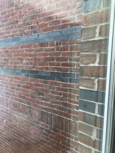
This represents repetition because the bricks are uniform and are in the same pattern throughout the building. The repetition makes it look neat and uniform and appealing to the eye.
2. Movement
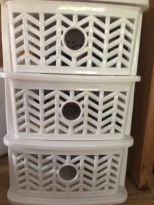
The pattern are the drawers use movement to draw your eyes to the center. It focuses your eye on one desired point and keeps the viewer interested. This makes the piece very appealing and interesting to look at.
3. Proportion
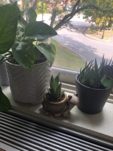
The plants are all different sizes, but the sizes look nice when they are put together in one area. By having the two larger ones to the side, it draws attention in to the center of the plants which is also the smallest one.
4. Variety
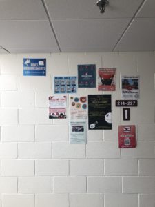
The posters in the hallway are all different colors and sizes, but when they are put together it creates a very appealing and inviting display that makes you want to look at it. The difference in how they are spaced also makes it intriguing how all the posters fit well together and create a nice image overall.
5. White Space
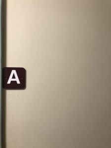
This represents white space, because it is a small A with a large amount of space around it which draws your eye to the A which is the focus of the image. It makes the A stand out against the plain wall.
6. Contrast
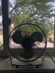
The contrast between the dark fan and the bright background makes this a very interesting picture to look at. The fan is dark which draws your attention to it and the background brightens up the picture which keeps it interesting.