1) Contrast
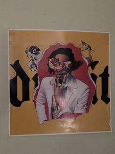
Their is contrast between the yellow and pink. The pink stands out and the yellow grabs your attention. The pink is one that stands out because they want to show the artist that is in the pink contrast. Also, the black text in the background makes you wonder what it says which grabs your attention even more.
2) Emphasis
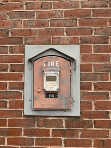
The reason that this is emphasis is because this structure wants to grab your eye to realize its importance. They do this so when anyone is in danger of a fire or smoke, they can easily see that it is a fire alarm that they can use.
3) Balance
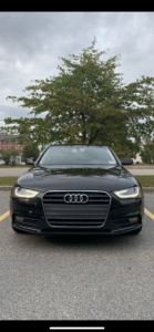
This is balance because the car creates a sense of symmetry but it also creates a sense of attraction and it looks fierce.
4) Unity
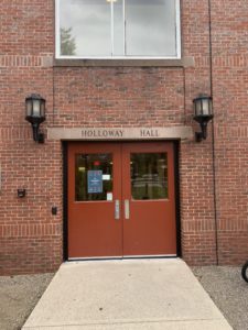
This picture is unity because the red on the doors draws someone’s attention to it but it also creates a sense of simplicity and makes you see that it is a welcoming door.
5) Movement

This picture is movement because the lightning next to the figure is supposed to look like its moving and the figure looks like he is creating the lighting with his hands.
6) Proportion

The reason this photo is proportion is because you can see the binders go from larger to smaller or look at it the other way and see it go from smaller to larger.
Gestalt Theory:
I learned that the gestalt theory shows us that objects and our surrounding can change the way we perceive something with our minds. It says that our behavior is influenced by using rewards, and that we turn visual surroundings into groups.