Gestalt Theory
Gestalt theory is based on the idea that our brains will naturally try to simplify complex things by organizing elements and recognizing patterns within the elements. Using this theory, designers can create aesthetically pleasing and user friendly designs that will make sense to the viewer. The main principles of Gestalt theory are:
- Figure/Ground – When a design takes advantage of negative space to convey multiple messages. This provokes the brain to decide which message is in the foreground and which is in the background.
- Proximity – How close to one another the elements of a design are.
- Similarity – The brain automatically groups together like elements in a design.
- Symmetry – The brain perceives ambiguous elements in as simple a manner as possible.
- Continuity – Our eyes will follow the smoothest path when viewing lines, regardless of how the lines were originally drawn.
- Closure – The brain automatically fits in “missing” elements or parts of the design.
In addition to the principles of gestalt theory, there are additional principles of design that help us to further understand how designs are perceived. These include repetition, rhythm, movement, balance, white space, proportion, contrast, emphasis, hierarchy, variety, and unity.
Variety
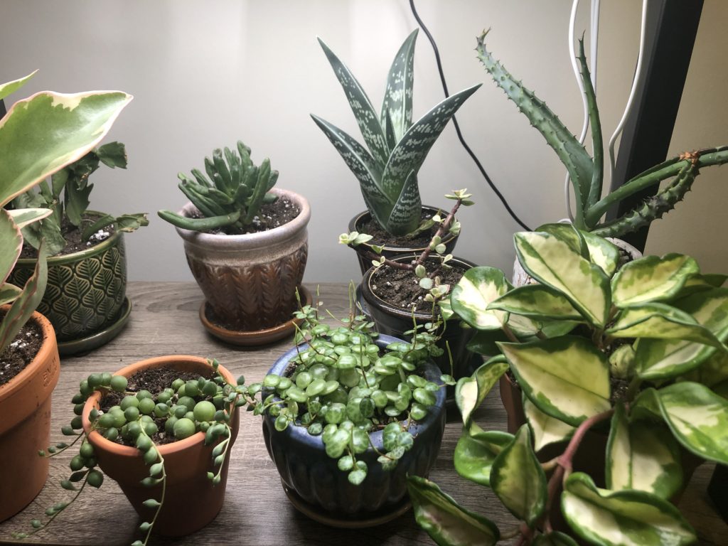
Variety is the idea that there are various different elements in a design that break up the monotony of a design or image. Elements could be different sizes, colors, or different from each other all together. I see variety in the image below because not all of the pots are the same, and each succulent is different from each other, however I do see a sense of unity despite the differences. I think the variety in the pots and the succulents themselves is what makes this image visually pleasing.

Movement
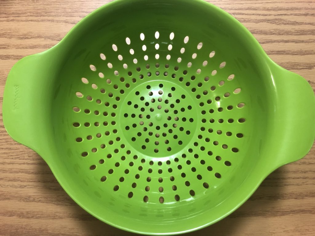
Movement in design is the idea that elements guide the eyes to a certain spot in the design. The image below is a colander in my kitchen that, in my opinion, makes use of both similarity and movement at the same time. The colander has tiny holes all over, but the spacing and perspective of the camera helps to guide the eyes to the bottom of the colander, which is at the center of the image.
Scale
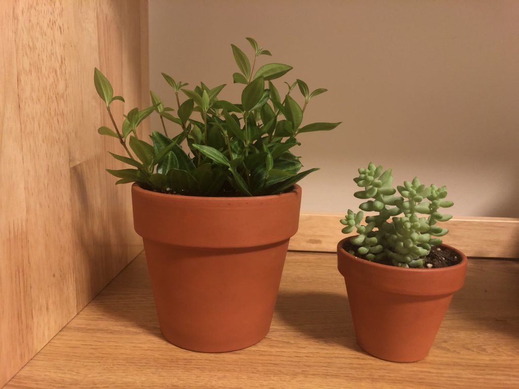
Scale is the relationship between objects and their size or weight. The image below is of two more of my house plants, one bigger and one smaller. The elements are similar, however one is bigger and greener than the other. Not only are the pots different in scale, but the plants themselves are different in scale as well. Additionally, the bigger plant is darker, which gives a bit of “heaviness” to the larger element, while the light-green succulent feels that much smaller in comparison.
Unity
Unity in design is when various unrelated elements come together to create a sense of similarity between the elements. The image below is of my roommate’s houseplants, which are all vastly different. Although they’re all different, the various colors and textures on the plants all seem to pull the elements together to form a cohesive image of greenery.
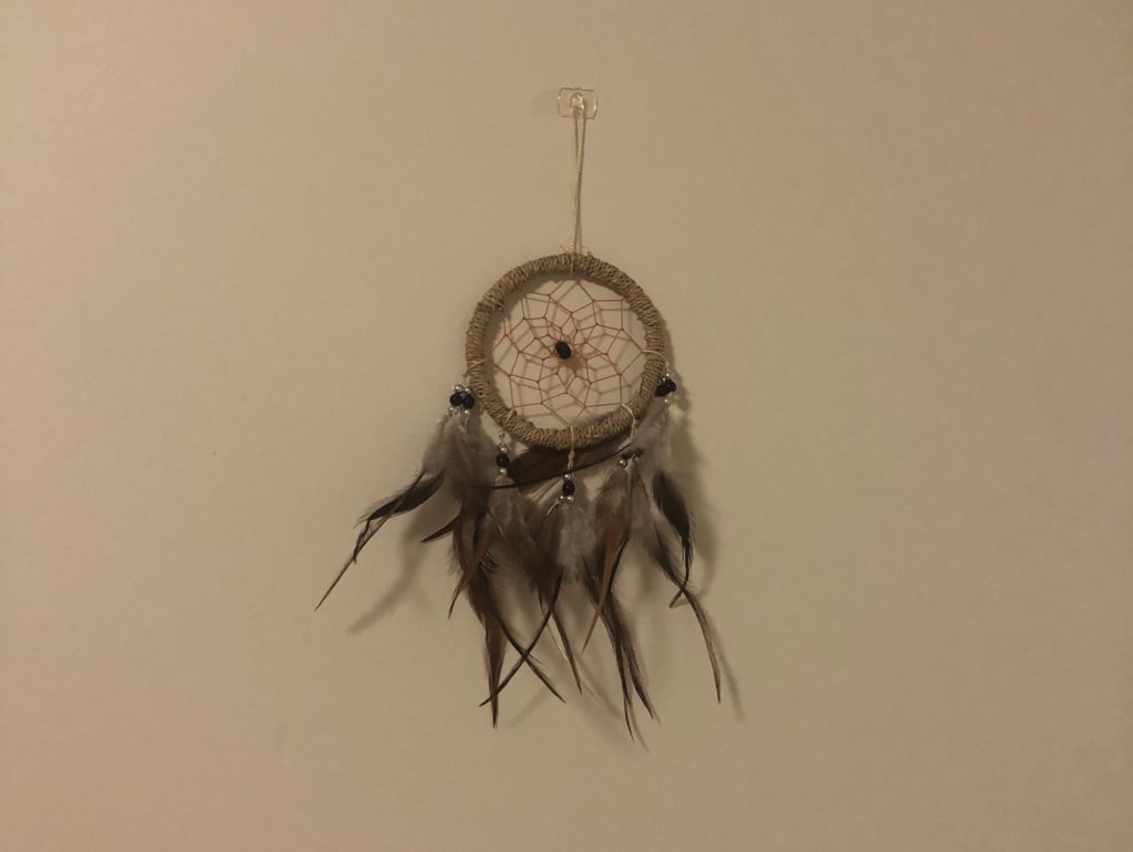
White Space
White space is the use of negative space in an image to draw attention to the element that has the most priority. The image below is of a dreamcatcher on a blank wall. The dark brown and tan colors of the dreamcatcher against the white wall creates a level of contrast that demands the viewer’s attention onto the dreamcatcher.
Contrast
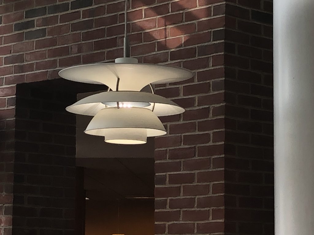
Contrast is when two objects are vastly different, but their differences create an aesthetically pleasing image. The picture below is of a pendant light in the student center contrasting against the brick wall behind it. The clean, modern look of the light fixture is a stark contrast to the rough, textured background.