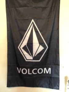
White Space
When looking at this flag it caught my attention how honestly only 30-40% of the overall area was used for advertisement. I also realized that by doing so it caught my eye and always draws me to the white “VOLCOM” logo. Even though it is not technically “white” space.
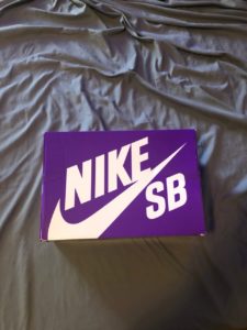
Contrast
I recently bought a new pair of Nike shoes. When they came in the mail I was surprised as to how vibrant and bright the shoe box was. The color scheme of the box was very interesting as well. Purple background with white lettering. This is definetly contrast.
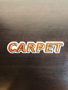
Movement
I noticed that this sticker for a skateboard apparel company was very different the first time I saw it. The way they designed the font for this sticker is super cool because I feel like the whole scheme is moving and leaning to the right. Almost like a “zooming” feel to the sticker. The multiple layers of font that are just barely not lined up give this effect.
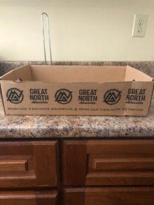
Repetition
I believe this next object is a beer box of some sorts. The only design on the cardboard is simply their logo 0f “Great North Aleworks” This is just stamped on the box three times on each side. Grabbing people attention since this is the only thing on the item.
Variety
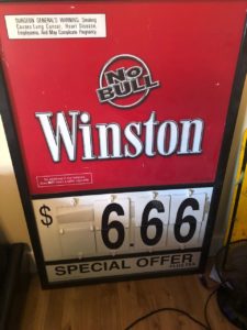
I own an old Winston Cigarette sign from a gas station. This could be described as many different principles of design but the one that stood out to me was the amount of variety in the advertisement. Yes, most of it is just simple text, but everything is in different fonts and placed out differently.
Unity
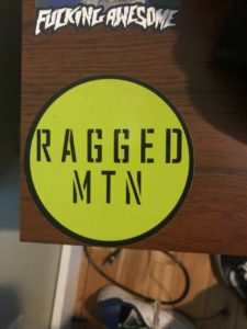
This sticker stood out as an example of unity to me for the fact that it looks so similar throughout the whole thing. Its straight forward and they dont mix anything up.
What I learned about Gestalt Theory
To be honest, I had never even heard of Gestalt Theory until this assignment, so everything is new to me. I guess overall the biggest thing I took away from learning about Gestalt Theory is how important proper and progressive design is in our world. It is used on so many things that I hadn’t put any thought into at all. Simple labeling or road signs are made to be easier to interpret and make us have to think less. Since there is so much going on it is helpful to have designs on objects that are easy to understand and help express “emotion”.