Graphic design has had many different ages within itself. All these changes characterize what graphic design is, and its amazing to learn and to read about how graphic design has evolved throughout the years of its lifetime. Some of the different ages of it have sparked me, and these include, the Arts and Crafts movement, de Stijl, Cubism, and Futurism. These different ages of graphic design has shown me so many interesting ways graphic design can be portrayed. Now I’m an going to explain why these different periods intrigue me.
Arts and Crafts
The first period that was interesting to me was the Arts and Crafts movement from 1880-1910. What stood out to me about this is that it was a focus on an approach to art. The philosophy of the Arts and Crafts movement was that handcrafted forms brought physical and spiritual pleasure to one’s work. What stood out to me is how much detail they put into their work. When you look at a piece of work made from the Arts and Crafts period, all I can see is how much detail the image has. At the same time though it doesn’t give you a sense of claustrophobia because the work is made to a point where the person who is looking at it can understand how amazing those little details are to the work. Also, since this was back in the upper 1800’s, it must’ve taken such a long time to finish their pieces, and that’s what I really like about this specific art is how much time and effort was put into them.


Cubism
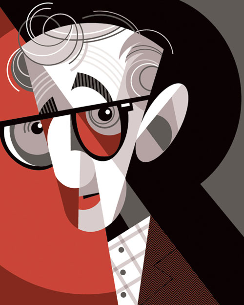
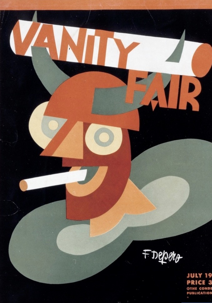
The second period that interested me was the Cubism age from 1907-1921. The artist Pablo Picasso was greatly influenced by the work and words of Cezanne. Picasso combined Cezanne’s philosophy with his own interest in the raw, abstract qualities of traditional African art. What stands out to me about Cubism is how raw and abstract the work is. It so creative and colorful, and what I like about it is how it can take a person hours to look at one piece of work to understand what is happening in the piece. I love how modern and complex each piece is. When you look at a piece of Cubism, they usually want you to focus on one thing in the photo, but they make it so its almost like a puzzle on what you’re looking at. I also like how its all made up of shapes that make something in the image. It’s such an abstract and creative age for graphic design.
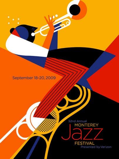


Futurism
The third age that really stuck out to me was the Futurism age of 1910-1918. This was the age where the horizontal and vertical alignments of typography. Letters were now used as expressive objects, and the printed page as a work of art. This period celebrated a number of abstract concepts like speed, machinery, violence, youth, and industry. What stands out to me, just like the Cubism age, most of the pieces are colorful and the work is very abstract. What I notice that is different is that they use more words and letters in their pieces to make more of an impact. It stands out from the rest of the piece to give a cool presence. The work is very complex but at the same time, is simple. They do this by also using a lot of big shapes for creating their image and that’s what I really like about it.


De Stijl
The last period that was interesting to me was the De Stijl period from 1917-1931. What I really like about this period is how simple it is. They mostly only consist of squares and rectangles with some text in them to spread a message of some sort. What I really love about the simplicity about it, is how it really catches your eye with the colors that the image uses. Even though there is not much to the work, I really love how there’s a pattern to it and everything is placed for a reason. Its not messy but it is abstract and I really like that about the work. What I notice as well is they use a lot of white, yellow, red and blue. It really makes the piece pop and catch the eye of the viewer. Since I’m also a very simplistic person, this age of graphic design really captures my personality in the work.


Throughout the different ages of graphic design, there have been many different ways people portray graphic design to be. It was amazing to go back and look at all the different time periods of graphic design and really see how it has evolved through the many years of its existence. It was amazing to see how much more modern we have become and with that how much more modern graphic design has become. Those four time periods of graphic design were the ones that stood out to me the most, because of their creativity and how each piece of work had an impact on me. Overall, I loved learning about these periods and I’m glad to share my opinion.