This reading, went in-depth in the history and evolution of graphic design. It was interesting to see how the styles of graphic design have changed throughout the past couple centuries. It was fascinating to realize that some of these styles only existed for a small portion of time in the scheme of things, but they left a long lasting impression on the graphic design world. The styles that stuck out to me, were aestheticism, cubism, futurism, and de stiji which I will go further in depth about below.
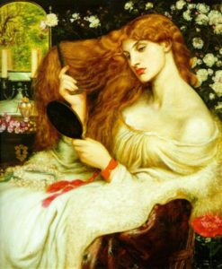
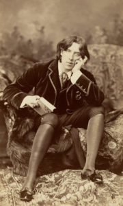
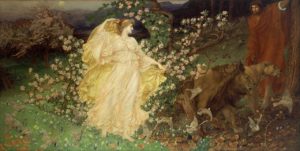
Aestheticism (1870-1914)
This movement could possibly have started as early as 1818, and was based on a search for ideal beauty. Their ideology wanted to remove art completely from commerce and industry and form a better connection between life and art. Oscar Wilde and Aubrey Beardsley were great contributors to this movement and created works that were new, and elegant. This style challenged the ideals of of mainstream victorian culture at the time. This form caught my attention, because of simply how beautiful the art is. The colors and detailing all works so well together to create a beautiful full picture.
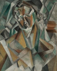
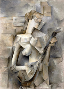
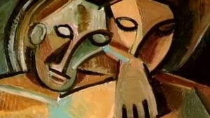
Cubism (1907-1921)
Picasso was a major influence to this period of graphic design. He combined Cezannes philosophy with his own interest to develop cubism. This art involved forms from multiple points of view at the same time, questioning the norms of viewpoint, reality, time, and space. They threw away the established techniques of past movements to create an entirely new movement. This art was given the freedom to be interpreted and to be shown in a new and interesting way. This form interested me because of how unique each display of art is. I have never been good at interpreting abstract art, but this style makes sense while also leaving room to interpret why the artist did what they did.
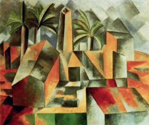
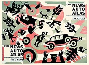
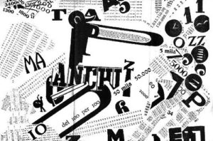
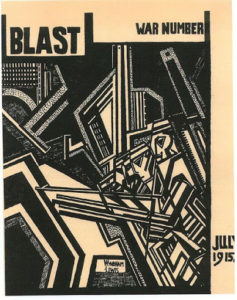
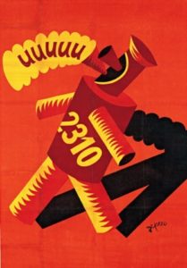
Futurism (1910-1918)
This period of graphic design caught my eye, because of how unique it is. Unlike the other styles, it seems as though each work of art done during this time is uniquely its own but they all also fit together. This art form used letters as expressive objects and the printed pages became works of art. This design form is slightly influenced by cubism through its abstract tendencies. This forms a hybrid of art styles which creates a very visually interesting result.
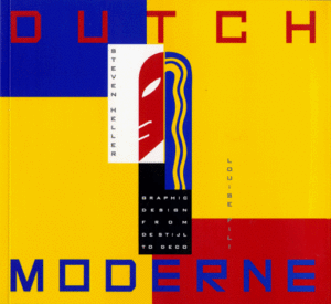
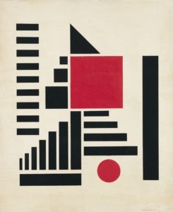
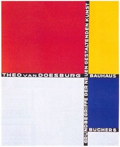
De Stiji (1971-1931)
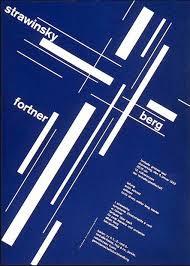
This art form is very interesting due to its use of straight lines, right angles, and primary colors. It uses the basics to create visually fascinating works. Even though there is commonly straight lines and right angles used in this art, it is very rarely symmetrical with asymmetry being the norm which is very interesting compared to the basic rules of the other parts of the style. This style later formed into the typographic international style. This style was very interesting to me due to its use of basic elements, because the final pieces of art are still amazing.
In Conclusion, this reading showed the different styles of graphic design in a very interesting way. I hadn’t realized how much each style differed from one another and how certain ones fit together. It was fascinating how some styles lasted for decades while some were only a few years and yet they still had a lasting impact on the evolution of graphic design.