Personal Response:
In my perspective, I was looking forward to hearing the good views from speakers about the use of Helvetica. It is shocking to me how much Helvetica is used in our everyday lives. Everywhere we go, the typeface follows you. What stuck out to me from the film was how typefaces were made back then to how we make it now with the use of computers. Erik Speikermann exclaims how he was 17 when he first learned typefaces. “You take a letter and you print for many letters, and you put the letters back on the shelf, and then you bring them out again.” He still uses printing in his production at 67 years old, but he has changed to working on screen.
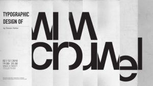
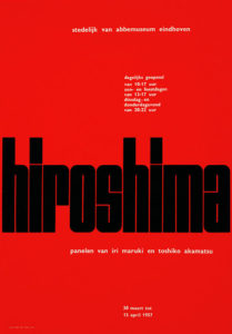
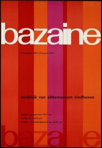
The meaning is in the content of the text and not in the typeface. -Wim Crouwel
Wim Crouel’s quote helped me decide how I should be creating designs or any artwork as an artist someday. When creating art, it isn’t about how you made it. It is the thought you put into the piece to make it your artwork.
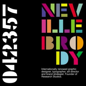
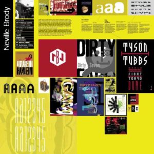
The way the message is [a]ddressed is going to define our reaction. -Neville Brody
Neville Brody’s quote suggests how I will react to different pieces of artwork. In the way that the message is introduced, I will be able to respond to a variety of artwork.
There’s a difference between simple, clean, powerful to simple, clean, boring. -David Carson
David Carson allows me to think about what certain typefaces stand out. He explains the contrast between what typefaces can be powerful or boring, determining on how you look at it.
Wim Crouwel

Neville Brody

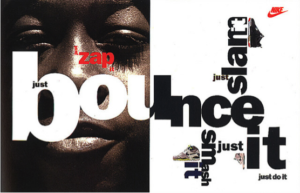
David Carson

