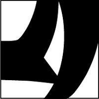
Use Only Two Letters
Using only two letters create a series of dynamic typographic compositions. There are many forms these compositions can take. Experiment with large and small letters, combining similar forms, contrasting very different letter forms. Ultimately your goal is to create beautiful and dynamic form by playing with letterforms.
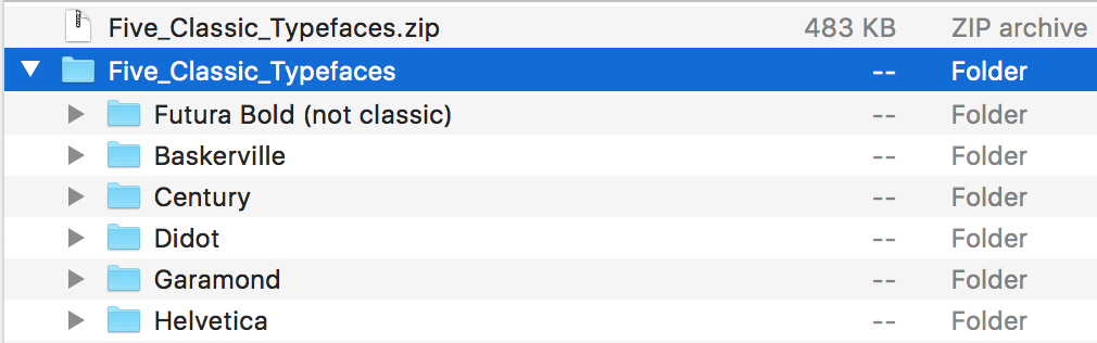
Download and install these typefaces.
What is flow?
As a designer one of your jobs is to control the attention of the viewer. By the design choices you make, you guide the viewer around the page. Your compositions will naturally have a flow to them. The viewer will start looking at something on the page and their eyes will move around the composition before coming to rest on a focal point. As a designer you have some influence over this process. Create compositions that activate the gaze and delight the eye.
Objectives
Your objective with this assignment is to:
- Understand how shapes interact to produce foreground and background relationships.
- Create stable, reversible and ambiguous figure/ground compositions.
- Learn how to manipulate letterforms using Illustrator
Rules of the Game
- You may only use two letters per composition.
- You make only use Garamond, Baskerville, Didot, Century, Helvetica.
- You may only scale and rotate.
- Do NOT stretch any letters.
- Both letters must be black on a white background.
- All work must be to size (6″x6″)
- You may use UPPERCASE or lowercase or a mixture of the two.
- You may use only the regular (not bold) and italic fonts of your typeface.
- Two letters MUST touch somehow. Even if technically off the artboard.
Make 9 Compositions
Make 9 6″x 6″ preliminary compositions in Illustrator using any two letters from the 5 class typefaces: Garamond, Baskerville, Didot, Century, Helvetica. Try to use different letters for all the compositions. The purpose of the assignment is the explore the alphabet.
3 composition with a small and a large letter
- Garamond
- Baskerville
- Helvetica
3 compositions with small to medium sized letters
- Century
- Didot
- Baskerville
3 compositions with 2 large letters
- Your choice of typeface
- Your choice of typeface
- Your choice of typeface
Keywords:
large / small / contrast / asymmetry / space / drama / focus / flow
Format: 6″ x 6″
Color: Black and White
Output: PDF file (added to Dropbox)
Due Tuesday, March 2
- First crit of a minimum of 5 artboards/examples of figure ground. Please design at least one from each of the 3 categories.
- PDF with completed compositions on DropBox in your your folder:
03FigureGround_lastname.pdf
Due Thursday, March 4
- PDF with 9 compositions on DropBox in your your folder:
03FigureGround_lastname.pdf