Introduction
When we first started the documentary I thought that it was going to be boring, but as we kept watching it was interesting to see multiple typeface designers perspectives on the Helvetica font. It was very fascinating to hear why some of the designers loved the font and how others refused to work with the font all together. I also never would have noticed until after this film how much Helvetica is used around us and how much we actually see it on a daily basis and might not even notice it. Designers like the simplicity of the font because it is very easy to read and very easy to navigate the font. Other designers wanted to get away from how boring and basic the font was. I also really liked how much typeface is changing and how many different types of typefaces there are. Michael Place said,”the idea that a design will stand the test of time.” He said this when he was speaking about his own work, but I believe it applies to all designers. They should be aiming to create a design that will be used forever.
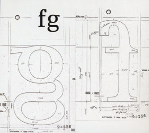
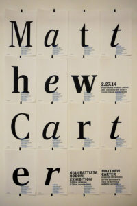
Matthew Carter
“One of the most beautiful things about Helvetica is the horizontal terminals.”
I really liked this quote because of how much passion he had while he said it. He truly loves this font and thinks it is beautiful. I love how pure his love was for the font and his work. I also like how he described the font and you can almost picture the font as he said this. I also liked how Matthew spoke in general, you can tell that he is artistic because of the way he spoke.
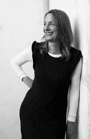
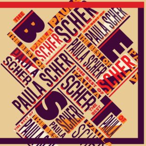
Paula Scher
“It never dawned on me that typography could have personality that drawings did.”
Paula doesn’t like Helvetica because it has to do with the government. She said that there are two separate cultures of design and and that the first one is corporate design. She relates Helvetica to the government then she relates it to the wars. She really wanted to get the point across that she didn’t like Helvetica. I really liked the use of this quote because she has so much passion for her work and really cares about what she produces. She wants to “feel” her work when she creates.
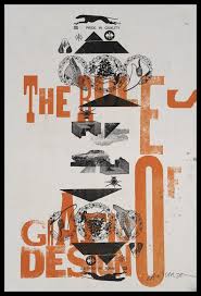
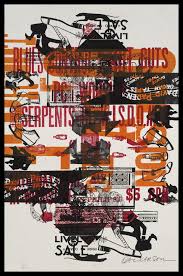
David Carson
“Don’t confuse legibility with communication. Just because something is legible doesn’t mean it communicates and, more importantly, doesn’t mean it communicates the right thing.”
David was my favorite speaker because of how straightforward he was about his feelings towards Helvetica. He doesn’t like how boring the font is and he likes the feel the words. Davids work is more loud and all over the place because thats how interprets what he is making. It says how things speak to him and then he works from there. I like this quote because what he is saying makes so much sense. It doesn’t matter if you can see the words well, it matters if the words match the design. If you have a really interesting background and a very basic font it is going to look out of place. That’s why I like this quote so much.