Introduction
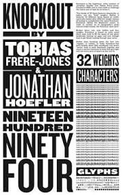
This movie we watched in class the other was about Helvetica which is a certain font for a text. Helvetia was developed in 1957 by a Swiss typeface designer named Max Miedinger. I thought the film was ok it was pretty boring but you can’t expect anything really exciting about a film with only interviews in it. But it was also interesting seeing the history with graphic design and how Helvetia really took graphic design to a new level.
Johnathan Hoefler “and Helvetica maybe says everything, and that’s perhaps part of its appeal.”
I like this quote a lot because it shows that Helvetica has a way deeper meaning than just the font of it. It shows that even though its just words it can be used like an image.

Paula Scher “It never dawned on me that typography could have personality that drawings did.”
I really like this quote because Paula wasn’t the biggest fan of Helvetica because it was a very standard and basic typeface. She believes that graphic design should be not just be a standard thing that every other company does it should be authentic and different because that shows how special it is with I totally agree with.

Erik Spiekermann “Its air, you know. Its just there. Theres no choice. You have to breathe, so you have to use Helvetica.”
Although I don’t really agree with this guy it is a good quote because to shows that using Helvetica is seconded nature just like breathing is. It also shows how passionate the guy is using Helvetica and shows how popular the typeface is compared to other typefaces.