I didn’t think I was going to like the film. When the first speaker began, I could barely understand what he was saying with his heavy french accent. Within those beginning few minutes I was already dreading the hour and a half I had left to go. However, as the film continued on and I waited for the time to pass by, I began to change my opinion on the documentary. I enjoyed that they went all the way back to how it was originally made, and at the same time would constantly slip in well-known brands that use the Helvetica font that everyone would recognize today. As more and more speakers would go through and share their perspective I kept getting pulled into what they were saying and would even agree with a lot of them. By the end I was finding myself appreciating more of the art, details, and concepts that all go into creating a typeface. Once the storyline finished, I was able to understand why they began with someone who I could barely understand, and now I’m able to say that I like how the director started the film all the way back to where Helvetica’s roots came from and that it ended at where it is today.
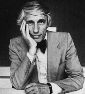
Wim Crouwel
“The meaning is in the content of the text and not in the typeface, and that is why we loved Helvetica very much.” – Crouwel
I enjoy this quote because it goes to show how simple, yet elegant Helvetica really is. In a way, he mentions why they chose to keep the font so basic. Almost as if he acknowledges the fact of how the customer is the one to decide what the meaning is that they want to portray with their product.
Paula Scher

“I think that type has spirit and can convey mood…” – Scher
This quote stuck with me because of how she gives a form of personality to her work. I completely agree and like that she brings it all to life in a way and doesn’t just see it as words on a paper. I like to think of each font to have it’s own story that comes with it and sort-of portrays the emotions behind the context. There’s so many different ways you can play around with typeface and it all shapes the way your audience views your work.
David Carson
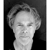
“There’s a very thin line between simple and clean and powerful, and simple and clean and boring.” – Carson
I really love this quote because it goes beyond just Helvetica and typeface. No one wants their work to be boring and bland, but with a few small changes and tweaks you’re able to make a bigger statement. It goes to show you don’t have to be all out crazy in order to get your message across. All you need to do is focus on the big picture and the few extra steps to help get you to your goal.