“A documentary about a font? How interesting could this be?”
Those were the exact words that coursed through my brain when the class was briefed on that coming assignment. I’ll admit, I wasn’t all hyped up for it, seeing how simple and… well, flat, it was presented. I certainly didn’t expect it to dive as deep as it did, and I’m genuinely impressed it got me so intrigued (enough so to be writing this past 2:40 in the morning, God help me). Not to mention it was pointing out a full-blown obvious concept that the vast majority of us wouldn’t have noticed unless we were told to see it. I was one of those individuals who never quite saw it. Though it felt strange since I knew everything looked so… familiar, but I was never able to put two and two together.
Erik Spiekermann laid it out rather bluntly; “It’s the default– it’s like air. There’s no choice, you have to breathe.” His words summarized precisely how I felt when I realized just how common Helvetica is. The fact that the same font can be found in most places is… unnerving, and yet I’m not entirely sure why. Danny van der Dungen had one quip about the “dangers of normalization” as if Helvetica should be branded as a dystopian symbol, a trademark of tyranny-by-popular-society. The chaos of free will ends up lost and obscured under the haze of plain, normal, and orderly influences. Case in point here, Helvetica’s dominance in our society.
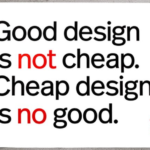
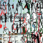
I personally do not dislike Helvetica. There is an absolute value in a universal, simple, and easy font that gets the point across as bluntly as can be done. However, that’s not saying I like it either. Like David Carson explained, “just because it’s legible doesn’t mean it’s communicative.” There is very little, if any, emotion to Helvetica, whereas the message being sent can be lost in simplicity. If it’s too neat and orderly, Stephan Sagmeister affectionately put it like this; “Do not read me, I will bore ze sh*te out of you.” In that case, perhaps a font a little more chaotic and abstract would help to get the gears turning.
So what’s the verdict? Do I like Helvetica, yes or no?
The simple answer is, “Well, both.”
There’s room in this world for the neat and orderly. There’s information that deserves to be displayed as legible and straightforward as can be done– for example, road signs. Signs in general are what highlight and alert us to the surroundings in simple, firm, clear messages. In other instances, say an advertisement wants to stir an emotional response with their message. In these circumstances, it would be better to get crafty and make that message truly unique and stand out. A more chaotic and/or abstract typeface would certainly help to accomplish that.
There’s room for both to coexist– order and chaos are both correct, and neither one wrong.
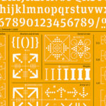
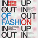
Erik Spiekermann’s Work

-
- Spoken like a true gent.
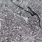
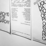
Danny van der Dungen’s Work
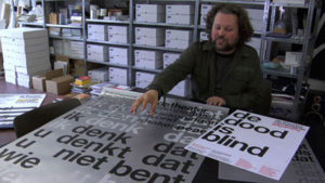
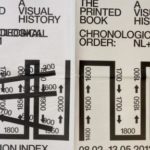
David Carson’s Work
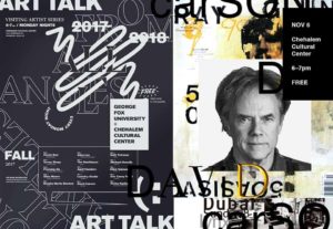

Stephan Sagmeister’s Work