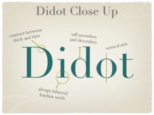
Similarities
There are a few similarities between Didot and Century. For example, both typefaces have strong contrasts between thick and thin along loops, ascenders, and descenders, which creates an elegant, formal feel to the lettering. Both typefaces are also serif fonts, meaning they have brackets, or “feet,” at the ends of ascenders and descenders. Finally, the default letter spacing of the two typefaces looks to be fairly similar.
Differences
Although the two typefaces are quite similar, that doesn’t mean they don’t have differences. Century has wedge-shaped brackets attaching the ascenders and descenders, while Didot has straight brackets without a curved connection, aka, they form a right angle. Century’s brackets also tend to be a bit thicker than Didot’s brackets.