Design Principles
After reading about the 11 Principles of design, I realized my interest in the way colors and shapes in certain ways can cause my brain to go on a journey. I enjoyed rhythm, movement, balance, white space, contrast, and variety.
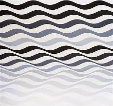
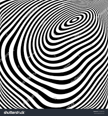
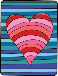
Rhythm
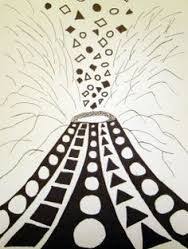
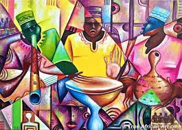
Rhythm influences emotions of excitement, making me very intrigued by this design. It looks like a design you’d find in almost every type of art, probably in the background or on articles of clothing in said art piece. It is almost like repetition, where you are repeatedly seeing the same features, but rhythm has varying distances, making it unique.
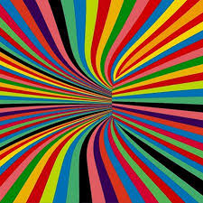
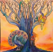
Movement
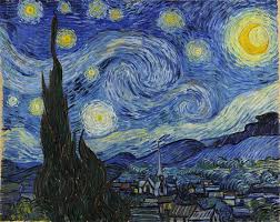
Movement helps guide the users eye through a path in artwork. I am very intrigued by movements intentions, I love when art manipulates me and my eye through a composition. When looking through examples, I found Van Gough is a very popular artist who uses movement design, especially in his piece ‘Starry Night’. Other examples include many hallucinating designs, similar to one example in Rhythm.
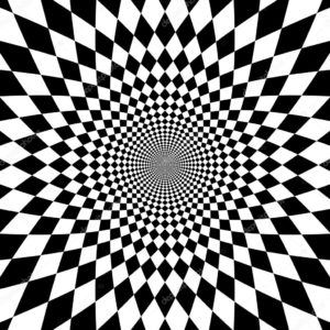
Balance
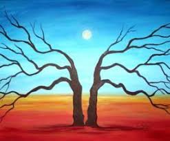
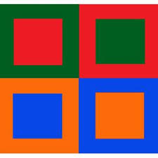
Balance is just how it sounds, when an art piece has equilibrium. What I enjoy about this design is the satisfaction it gives. There can be different sized shapes, as long as it takes up the same space as other shapes. When looking at examples of balance design, it did just as I said, I felt satisfaction when looking at each piece below.
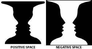
White Space
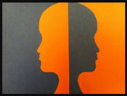
White space is when an artists uses white and black as their primary colors, making images out of both colors. The viewer then can depict the shape of each color. seeing it one way first. This shape is depicted because of the “empty”or negative space in any design.

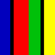
Contrast
Contrast is a design used to enhance details, allowing you to see bolder colors and shapes. This design allows for a lot of emphasis on elements. When looking at examples, I was brought to attention easily by looking at all the detailed pieces. Many examples had neon colors to just that.
Variety
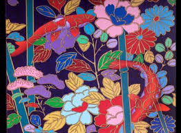
Variety is one of my favorites because I love when things are random, especially art pieces. I believe it creates more interest for me than any of the above options. When looking at the examples, I had fun depicted each piece, and seeing how many pieces are in one.
Gestalt Theory
When reading the two articles, from my new knowledge, gestalt theory is a pattern with unity. Meaning that the artwork comes together to create a neat design, with not too much variety. By acknowledging this, I now know that all above design examples would work with Gestalt theory other than variety due to its random designs that are in-cohesive. With that in mind, I believe balance looks best with this theory because it will bring maximum satisfaction in my opinion.
Gestalt interested me a lot because it did not start as an art theory, in fact I don’t even think there was any intention of it coming to the art world. Gestalt theory started in psychology as how people see things in a whole form. When studying how things go together, it wasn’t long until this was put into an art piece to show perception visually.
In art Gestalt can be found with symmetry, proximity, simplicity and more, all allowing us to perceive the pieces as a whole. These designs are all based on how the human brain wants to fill in spaces when looking at many things. All of these examples and more, are very simplistic due to this study. Its simplicity works through grouping, where many things become unified in order to make us perceive in a certain way.
I am very interested in gestalt due to its many forms and how it all started. The fact that psychology came into art is very intriguing and allows me to have a different perspective on my own brain.