Introduction
When thinking of graphic design, my brain immediately goes to working on a computer. This article helped me realize it goes way farther back than just working on an old monitor. I wouldn’t have ever thought that what the Egyptians wrote on walls would be a form of graphic design! I began this class with a stubborn head thinking we’d only sit on computers and occasionally doodle on mac’s. However, the more research we do and projects we complete, my perspective on graphic design has completely changed.
Futurism: 1910-1918
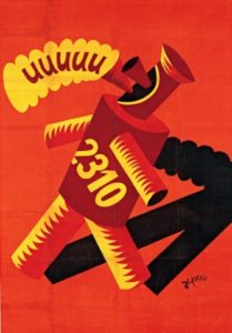
One of my favorite parts about futurism is how creative artists would get with designing the text on posters and almost distorting photos in a purposeful way. It reminds me of old cartoons I’d watch growing up as a kid. I’m impressed with how designers worked to show noise and speed by breaking the ‘rules’ of graphic design. This website shows many great examples of the different sub-categories with futurism. I even found a video about an artist named Fortunato Depero who created a lot of amazing work with the futurism movement. Futurism is very playful and can be done in so many different ways that it’s so easy to incorporate it into one’s work.
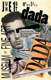
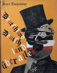
Dada: 1916-1923
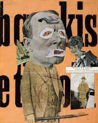
This period of art history is so interesting to me. The fact that their entire concept is, ‘art is dead,’ and therefore anything NOT considered to be art, would fall into the dada movement. The urinal made me laugh, but I also like the fact that, that’s it. It’s that simple. Anyone can easily create something to be considered dada. Kurt Schwitters is a well know dadaist designer. Despite being such a simple concept when it came to the art portion, this was really more about the movement and taking a political stand. Artists used many different references and comparisons when it came to getting creative on how they’d take a stand with things. Whether it was big or small, everyone has their own voice and opinion, I really enjoy how the Dada Era was able to help so many express themselves.
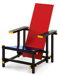
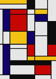
De Stijl: 1917-1931
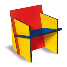
I love how clean and organized this period of design history is. You see it quite often now with modern houses and architecture. I find it to look very sleek, and Piet Mondrian’s art even reminds me of stain glass windows. This would be a fun project to try and tackle in class, maybe it’s even a way to take geometric translations a step farther. It’s almost as if there’s different layers when it comes to colors, and a completely different portion of layers when it comes t0o patterns, lines, shapes. Somehow they all fit together very cohesively. Gerrit Rietveld does an amazing job with de stijl in architecture. They might not look like the comfiest chairs to sit in, but still very appealing to the eyes when looking at the entire space.
.
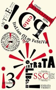
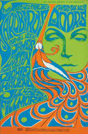
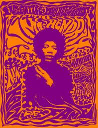
Psychedelic Language: 1960’s
The one word I would use to describe the retro-ness of this design period is, “groovy.” I’m obsessed with the play of colors, the flow of both the text and the art design. I feel like just by looking at a lot of the art created during this time period, you’re able to grasp and go back in time to what it was like to be alive back then. I’m fascinated by the idea that designers such as Wes Wilson took advantage of hand writing his posters to create secret messages for others. Plus many of these artists are probably still alive with them only being our grandparent’s age. This is definitely one of my favorite points in design history. I loved doing the color translations project in class. Being able to pick color schemes for that reminds me a bit of the funky colors artists would use with designing back then.
Summary
Psychedelic Language is probably my favorite design point in history out of the four. I love the vibrant colors that come with it. I one hundred percent think today’s teens and modern society is influenced by these different parts in history. I’ve noticed how graphic design can be both very simple or full of details and still serve a certain purpose when it comes to relaying a certain message to your audience. I think any piece of graphic design can be considered great. Whether it’s from the color scheme, the pattern, use of space, or even the actual words on the page, each designer is unique and incorporates their own twist into the different eras of graphic design.