Well, that was certainly interesting.
Alas, that’s not a bad thing.
Early on, graphic design is labeled as a craft that learns from the societal sphere around it; politics, culture, physical surroundings, and et cetera. All the while, it has effects of its own on the wider world. That was a curious thought, as it almost seemed like the field of graphic design as a whole is like an AI– it observes, learns, and then executes. Rinse and repeat as needed. I feel obligated to bring this up as I realized that the process was in my head subconsciously, that I was following those exact steps in all the work I did. Dare I say, call it “inspiration”, but this observation of the world and channeling it into a piece of art is exactly what inspiration is.
I’d almost say I’ve learned from observing these stylistic periods too, for further projects down the road.
Aestheticism
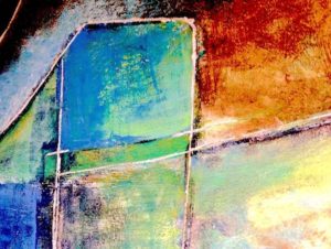

Aestheticism immediately caught my eye by definition– that being “art for the sake of art”. I stifled a giggle when I read this because this was, and still is, vastly how I’ve approached art, especially in my cartography. There isn’t any political or cultural statement to be made in most of the work I’ve done, at least not blatantly. Finding an employable meaning in it warrants a viewer studying the piece, telling themselves the story from what they observe. Cartography specifically isn’t really any different from this; making a scene tells a story without words, without spoon-feeding the explanations.
Aestheticism is nearly one and the same. It’s art for the sake of its beauty, and not necessarily that it serves a utilitarian role. It still holds a purpose, albeit an obscure one. But alas, the longer one studies the work, the more pieces fall into place.
Suprematism
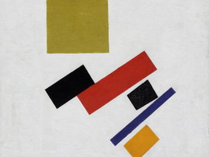
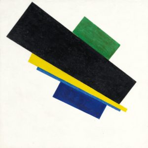
I picked this one for the express purpose that I don’t like it.
As mentioned earlier, sometimes it’s better not to feed the meaning of a piece to the viewer, to hide it behind the shroud and have them search for it. However, it’s a little difficult to hide its purpose if there really wasn’t one to begin with. Suprematism takes that hidden-meaning prospect and cranks it as far as it will go, in that there really isn’t any visual purpose at all, leaving that squarely in the mind of the viewer to make sense of it.
As for me, though, that’s a bit too far. Art has a spectrum of simplicity/utility on one side and complexity/beauty on the other. Suprematism is so much of its own extreme that it doesn’t fit on either side; as such can’t be effectively used for either, making it… well, useless. On the flip side, suprematism appears to be praising this idea of adverse meaninglessness, so… maybe they achieved the desired effect in doing so?
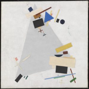
Constructivism
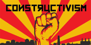
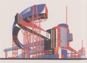
This one was a curious one, as this embodies the exact opposite of Aestheticism. Under normal circumstances, I wouldn’t necessarily like this, as the work is almost purely for utility and not for the sake of beauty. But as a matter of fact, I actually like it, even if it’s “eww, propaganda”. That of course begs the question; why would I like it, if it’s the opposite of what I’m familiar and comfortable with?
Both constructivism and aestheticism have a common purpose– they’re made to trigger an emotional response. For aestheticism, that emotion can be whatever it wants to be, but constructivism lingers around everything propaganda would represent: fear, anger, nationalism, and et cetera. It retains its meaningful properties and utility, vastly unlike suprematism. It’s more or less a fondness for art that isn’t useless, whereas both aforementioned extremes have their purposes to serve.
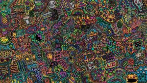
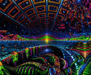
1960 Psychedelics
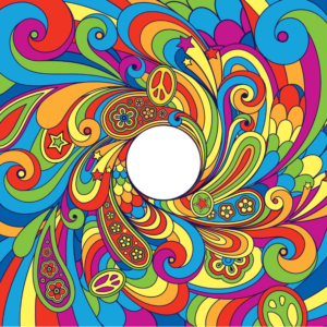
Vintage Concert Posters n’ Stuff
Now, this was a nostalgia trip.
For the record, my parents are old. Don’t tell them I said that or they’ll kill me.
They were both born in the ’60s, they grew up with this movement; the culture, the hippies, the rock culture, and everything in between. I grew up in the early 2000s, when they still possessed a significant amount of their old mementos from their earlier years, all the way into the ’90s. My dad was, and still is, an AC/DC fan and my dear old mum still rocks to Aerosmith, and they still have the t-shirts and old CDs. A vast portion of them is still complete with their artistic designs that looked strikingly on-par with the psychedelic movement; bubbly, abstractly expressive, and almost blindingly colorful design. Considering the movement became widespread in the ’60s, and the societal norms of the day, that was something of an aha-moment. It still widely stuck around even in the 2000s when I was young.
That bubbly, almost drug-high color in this style is representative of… well, getting high, where your mind goes wherever it wants to in some sense of enlightenment.
LSD is a hell of a thing. At the very least, I’ll give them credit for being honest.
In Closure
I gotta admit, making artwork and writing about it never really made me physically and mentally exhausted as any other project would. I’m not entirely sure what spurs me on to do it, but I reckon it’s a sense of inspiration, a duty to present a fictional display with a real-world message for others to chew on for a while, or something to that effect. On the bright side, looking at the history of design helped me to put a finger on it– recognizing that “inspiration” comes from everywhere, taking the form of “learning”.
Every one of these art movements is a result of this learning, from what I’ve seen. They are reactionary, if you will, stemming from modern society and its faults: politics, religion, cultural norms, and everything in between.
But alas, that’s not limiting me to “ride the wave” and follow wherever the movements go. Artwork is like cooking; the best chefs don’t follow a recipe, and for artists, following in others’ footsteps isn’t particularly effective in distinguishing oneself. You do that by chasing your own ideas. And if they’re done right?
Maybe those others will learn from you instead.