The description of the documentary kinda sounded boring to me. I felt like it was going to bore me. While watching, it was interesting to see just how often Helvetica is used everywhere. The B-roll of it all is something that I found particularly interesting. I didn’t realize how common of a font it is until it was pointed out. The reasons the typeface designers liked/disliked were fascinating as well. The duality of how some strongly loved it vs how some strongly hated it was something that interested me. This film also changed my perspective on typefaces in general. I already was intrigued with them but never took the time to think deeper about them.
Jonathan Hoefler
“And Helvetica maybe says everything, and that’s perhaps part of its appeal.”
The reason this quote appeals to me is because of the specific phrasing he chose. The thought that Helvetica can be used for virtually everything is a very interesting one. I think there is also some truth in that. The font is one that is used on every poster, every billboard, every magazine. It is constantly being used to say everything. It’s hard to think of what Helvetica isn’t used for now. It makes me think about how just often this typeface is used in our everyday lives. How many times it’s been used to say everything and we have just never noticed it.


Erik Spiekermann
“It’s air, you know. It’s just there. There’s no choice. You have to breathe, so you have to use Helvetica.”
When I first heard this quote, I disagreed with it. I wondered how and why you would just use Helvetica when other fonts exist. After coming back to it, I understand what he was trying to say. Helvetica is used so often that it’s become second nature. Most people consider using the font as simply a task as breathing. It shows me how passionate he is about the font and its use. As someone who doesn’t really consider the font as often, it was thought-provoking how many people consider the use of it so important.


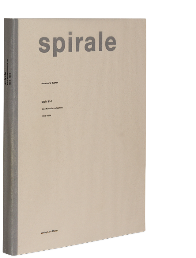
Lars Muller
“And I think I’m right calling Helvetica the perfume of the city. It is just something we don’t notice usually but we would miss very much if it wouldn’t be there.”
This quote also stumped me a little. I truly hadn’t realized Helvetica’s influence until I saw all the B-roll of the font in the different parts of the city. After watching it, I saw Helvetica on all the posters and signs around campus. It made me appreciate the typeface a lot more. I’ve come to agree with him on how it would be deeply missed when taken away. The simplicity of the font is what makes it so versatile and yet so subtle at the same time. I truly can’t imagine not seeing it everywhere I look anymore.