Introduction
I was very interested in seeing all the different designer’s thoughts and opinions on the typeface Helvetica throughout the film. The film caught my attention as there were images of texts in everyday life using the font. Multiple businesses and restaurants that all used Helvetica, all around there are Helvetica, and it so overlooked because not many people know about it; I certainly didn’t before this film. I found it particularly interesting when a designer said that it’s not about the lettering in Helvetica. It’s about the negative space between it that makes it look so appealing. It is a very simplistic font, and that sometimes simple is enough, like in this case, due to the enormous amount of usage this typeface has been used. I enjoyed how toward the end of the film, some designers really didn’t like the font because it is overused and seems almost too simple. I can see from both perspectives how this typeface is really nice and how some people think that this font is outdated and has been overused for too long. Overall the film was enjoyable to watch and learn about all the brands and logos that use Helvetica and the thoughts and opinions of different designers.
Wim Crouwel
“The meaning is within the text, not within the typeface. That’s why we loved Helvetica so much.”
This quote states so much meaning behind Wim’s thought process and what he thinks about the typeface Helvetica. It states that people shouldn’t be so focused on what the lettering looks like, but they should be more focused on what the meaning of the text says. For example, if there were a fancy typeface on the amazon logo’s text, people would be more drawn to the look instead of the meaning, an online shopping enterprise. At the end of the quote, he used loved as in past tense, but he never states that he no longer likes the typeface or if he still does, but I think that he used the word in the past tense because he knows that not all designers enjoy the simplistic typeface anymore.

Mike Parker
“A letter that lives in a powerful matrix of surrounding space.”
Mike is speaking to the viewer, letting them know that the typeface Helvetica is all about the space between and around each letter. The typeface is universally simple, meaning everyone notices that the font is easy to read and understand, all while looking good. Everyone has their own opinion and that they enjoy the font and its satisfying to their eyes or don’t enjoy the font, and they think that it needs a new look or something to spice it up to make it look better, more sophisticated.


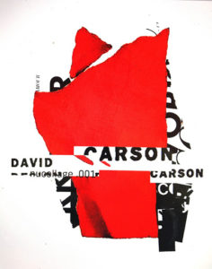
David Carson
“There’s a very thin line between simple and clean and powerful, and simple and clean and boring.”
The quote states that Helvetica is simple, clean, and boring. The viewer knows this because David is one of the multiple designers who is annoyed with how much Helvetica is used. He thinks that there should be more creativity and life to a typeface that is universally used. David’s work is all over the place, meaning his work has no pattern. It’s creative and is really different when it comes to the text within the designs. When listening to David during the film, he was very true and down to earth with how he felt about Helvetica and how he feels that it’s boring and needs to be changed to something new and fresh during this time period.