Recently, my class watched Helvetica, which is a documentary on the typeface and how it was born. Helvetica is all around us and whether or not you noticed, it is used in most common brands across the globe. I never put much thought into Helvetica until I was shown this film. In my eyes I never focused on what type of font was used for most brands. I’ve gone through life only knowing my common types of fonts like Arial and Times New Roman for my essays in school. I know I have seen Helvetica before, but it did not mean something to me till after the film. I liked how I saw the different perspectives of many different types of designers across the world. It made Helvetica stand out more knowing it is not only in my country, but others as well. The film gave me more knowledge on the type face and will make it stand out more in the future. For instance, I saw one of my favorite tv shows called The Office using that typeface as well as the brand Coca-Cola and much more. It really showed me how popular it is and how blind I was to it.
Mathew Carter


“I could’t second guess Helvetica because I wouldn’t know what to do”- Mathew Carter. This quote is funny to me because upon looking up Mathew Carter’s work I found his long line of work of fonts he has created. He has created 41 fonts in his 50 years of experience as a type designer and topographic technologies. (Those fonts can be found here). With such a high number of fonts he has created, was Helvetica his stem for all of them? His quote says he would be lost without it. This is interesting to me as it makes me think maybe Helvetica gave him the inspiration and ways of creating his own type of fonts. Without Helvetica, would he have been able to do so? Maybe, but would they have been as popular as they are today? It is something that makes me think and I wish I could ask him this question.
Erik Spiekermann


“Now it is probably never going to go away it is just air, it will always breathe Helvetica”-Erik Spiekermann. Erik is a german topographic designer who has had to live with Helvetica. Erik’s quote shows how something can be so strong that it will never go away. No matter if you like Helvetica or not, it will always be around. I like how Erik used a metaphor describing Helvetica’s life span. How it is something we always use everyday and will see everyday. Spiekermann is more of a different type of designer and some hate him for it, but I like how he is not like the rest. He has created his own unique way that does not follow Helvetica. He has tried to avoid it, but it is difficult as he described it as air and we cannot survive without air.
David Carson
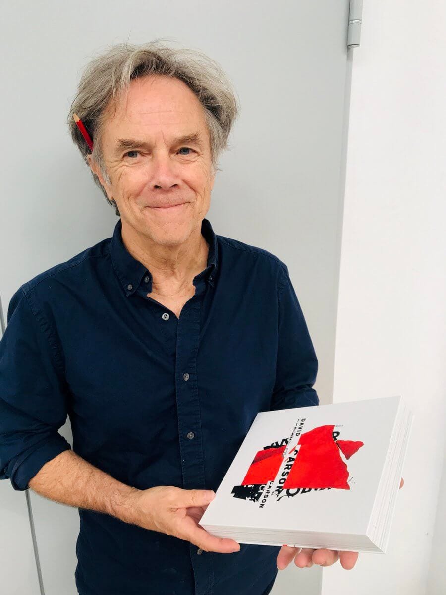


“Just because something is legible does not mean it communicates the right thing”- David Carson. This quote is not very long in length, but is very complex and simple at the same time. It was one of my favorite quotes because I have seen it before first hand. I will see an advertisement on tv for a brand, but that advertisement does not describe what they are trying to sell. Why would a company put an ad out for the consumer to not even know what they wanted to show? The same goes for fonts. Some fonts fit better than others and it might be more legible, but it will not be as clear as another font would be. Sometimes some things fit well and others don’t for portraying a message.