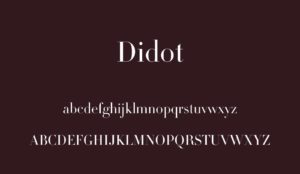
Didot and Helvetica -Differences
Didot is a very classy-looking font while Helvetica is very nicely spaced and all letters have the same amount of space and thickness to them. Didot’s lettering is tapered off at the end with thinner lines while Helvetica is straight forward cut letters. In Didot in the letter O, and the tail end of C there are bowls the curve the edges of each letter that make it go from a thinner line to a thicker line. Helvetica has the same simple boldness to each of the letters of its alphabet. Didot is also a modern typeface as opposed to Helvetica’s sans serif. The spacing between each of the letters on each of these typefonts is very different, Didot has closer spacing and Helvetica spaces out each letter to have the same distance between each.
Didot and Helvetica – Similarities
There are a small number of similarities in each of these fonts but there are some. One of these similarities is that the stems of each of the letters are thick and bold like. The other similarities are that both have ends to each letter and that the anatomy of some of the letters are similar.