Principles of Design
1) Repetition
Repetition in design is when a component is repeated with another component that has similar features to create a piece. To me repetition is very calming to look at. It allows the piece to have varying features without it becoming too busy while also ensuring that the components work in a way that they bounce off one another.


2) Contrast
Contrast is a very interesting principle to me and has always been important when I am creating my own art. Without contrast, images may not be as creative to look at and a lot of images would lack things such as foreground and background. For instance there is contrast between light and dark colors as well as contrast with textures and focal points like the up close leaf photo below.


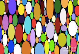
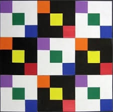
3) Variety
Variety allows for more creativity in art and images. It allows for a similar concept to be performed in multiple different shapes, sizes, and colors creating a more colorful and interesting piece. If the dots below were all one color the picture would be boring and bland but the different colors make it fun and enjoyable to look at.


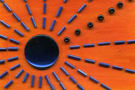
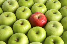
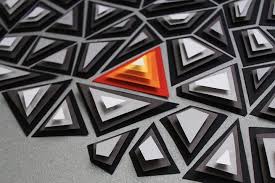
4) Emphasis
Emphasis is the the specific point that is supposed to draw the persons eye. So no matter how busy a photo may be, emphasis allows for one point to stand out than all the rest. Like the triangles for instance. The colorful, orange triangles draw your eye and make an otherwise black and white be more fun. I enjoy working with emphasis myself because it enables you to pick where you want emphasis to be despite what somebody else may recommend.

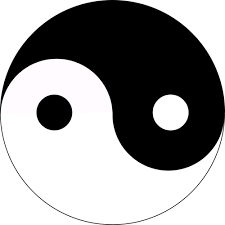
5) Balance
Without balance in life, graphic design, art, or anything there would be chaos. Balance allows for a sense of unity and completion. There is no stray spots that make it confusing and allow for something to be whole and complete. This principle is certainly very important and when working I am always looking for ways to add more balance. It could be as simple as making something symmetrical that bring balance to an otherwise uncoordinated piece.
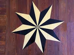

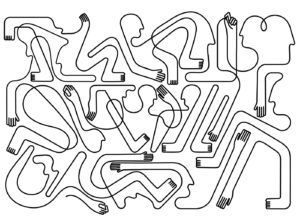
6) Rhythm
The final principle I chose was rhythm because I feel as though it is one that I do not usually think about besides maybe in music. I feel as though rhythm and balance in the sense that they draw everything together and make a piece complete. Rhythm allows for creating elements to be repeated which overall creates unity. It was very interesting to me to look at different images of rhythm and seeing just how common it is but easy to look over as well.

Gestalt Theory
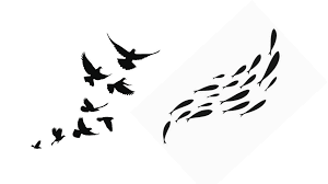
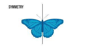
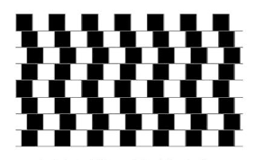
The Gestalt theory was very different than other theories of its time. Unlike others, Gestalt psychologists believed that perception, learning, and cognition were not as simple as others believed. These psychologists thought that these processes were muck more complex and could not be understood by splitting them into parts. Insight, holism, and problem solving were just some of the complex ideas that Gestalt psychologists became interested in. After being introduced into psychology, this theory was soon applied to visual perception by people like Max Wertheimer and Wolfgang Kohler. They found that when we perceive something in the world there are many different signal coming in that we visualize as groups. As time went on and we began to learn more, Gestalt psychologists were able to create a list of basic principles of visual perception. This list has become especially valuable for designers today. The idea of these principles was to attempt to explain how “our minds are able to perceive different visual components as being part of the same group.” The first principle on the list was simplicity. Simplicity said that our minds see things around us in their simplest form. When designers tackle simplicity they must balance the use of uncomplicated shapes and objects and the need to produce striking design effects. Next on the list was figure ground which helps to explain which element in a design is the figure (the focus point) and which element is the ground (the background). Using figure ground can often greatly impact how others see your piece and what they see first. Proximity is third and is all about how spacing in an images allows us to perceive different things. For example, several small objects put together in close proximity may form a large overall image that the viewer sees before seeing the smaller objects. Fourth on the list is similarity. Similarity can be displayed through size, color, texture, etc. and allows us to perceive elements as belonging together if they look like each other. Next is common fate which is when visual elements move together in unison and we see them as a part of the same group. This particular principle is especially important when handling 2D and 3D. Symmetry follows common fate on the list and are seen as a part of the same group. For instance, two different objects when placed together may appear as one solid figure because they are symmetrical despite whatever differences they may have when they are separate. Seventh on the list is parallelism which is when inclinations and slopes of a design are associated as a single group. Continuity is the eighth principle which allows for elements to be associated visually if they are aligned with each other. Closure allows us to see elements belonging together in one group if they are a part of a closed figure. This is often seen in company logo designs such as FedEx. Common region is second to last on the principle list and is when several elements are a part of one region and are seen as a single group. Last but not least on the Gestalt principle list is element connectedness. Element connectedness is when images are perceived as being united as one if they are connected by other elements. Overall it is clear that the Gestalt theory and its principles has had a huge effect on not only psychology but also our visual perception of the world around us and the designs that we create.
1)
2)
3)
4)
5)
6)
7)
8) 
9) 
10) 
11)