After reading through the article, I chose repetition, movement, balance, white space, emphasis, and variety for my six principles of design to learn more about.
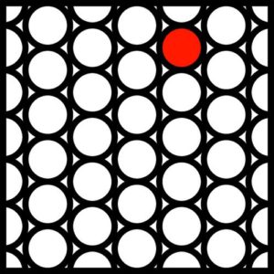
Repetition
Repetition is a more common and easier identifiable principle of design. It is a common feature shared among different components. However, despite it being seemingly super obvious, it is sometimes not as blatant. A simple example would just be a classroom, especially this year. There are an exact number of chairs per table and all spaced equally apart. Another place we see this would be in our dorm rooms, with the same exact desks, beds, and dressers.

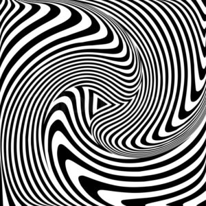
Movement
Movement is super important because it shows the viewer where to look throughout the piece. It acts as a guide to show how the piece was intended to be read or viewed. It is something that is super relevant in our day to day lives. For example, we see movement in the television industry. Commercials and movie trailers are an example of this. They want to be visually appealing for the viewer and show the most important aspects.
Balance
Balance is a more complicated principle of design because you can have a mono-symmetric, multi-symmetric, or asymmetric design. It is all about balancing all parts of a design even if they don’t look the same. The way that I see it that makes the most sense to me is if you take a boat. If you have a lot of items or people on one side of the boat, it will start to tip into the water and possibly sink. Even though the people and other items are different sizes, if you take all the people and the few items and place them on opposite sides of the boat, it will end up evening out.

White Space
White space, also known as negative space, is one of my favorite principles of design. It is inadvertently in almost every design. When I think of white space, I automatically think of websites or even our textbooks. It is all the space around the objects, which ends up really creating the design. Textbooks utilize white space, as there is usually the main text, as well as pictures, captions, and side paragraphs. The white space shapes the design of the page.

Emphasis
Emphasis highlights the most important aspect of the design through other principles of design. One of the things that I first think of is even just in our graphic design posts. Sometimes we add pictures or links and these would be emphasized by making the pictures bigger or having the links be highlighted. The viewer would be drawn to these things and make sure to pay closer attention to those aspects of the post.
Variety
Variety is important because it is a principle of design that keeps the viewers interested. Sometimes layouts get boring or too repetitive. Variety helps keep things interesting. An example of this that I thought of was in photography. Often, photographers will take pictures of a client in the same outfit and even the same background, but in different angles. They can also edit the pictures later to make two of the same picture different, like making on black and white, or adding exposure.

Gestalt Theory
The Gestalt Theory was actually very interesting to me. Overall, it is clear to me now that the principles of design are equally psychological as they are artistic. And the Gestalt Theory helped me see that just like the other principles of design, there is a deeper meaning behind the design. They are meant to trick the brain into seeing the design in a certain way. The Gestalt Theory shows designs as simple, but only at a first glance, and then they transform in front of the viewers eyes. One picture can look like something else based off of their size, angle, contrast, etc. I think the Gestalt Theory really just tied the principles of design together for me in seeing that the principles of designs are so much more than they appear.