Principles of Design
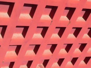
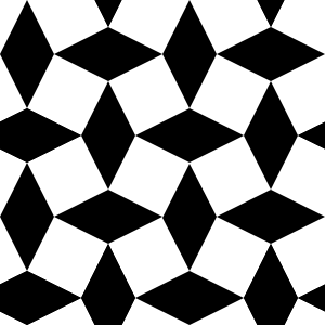
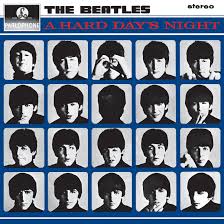
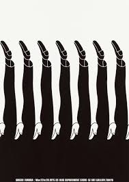
Repetition
“A component is repeated when other components with features similar to it are arranged in a composition.” In my opinion, having a design piece that has repetition and consistency is very catching to the eye. It can make a complicated and messy piece of work into clean and structured designs.
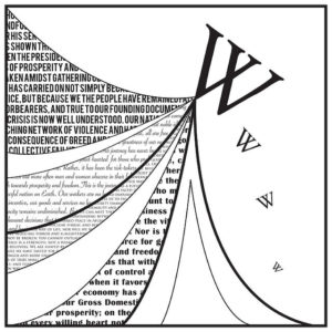
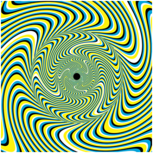
Movement
“Movement means guiding the user’s eye to a predetermined path in the composition.” This reminds me of artwork that looks like optical illusions that trick your eyes, and there is usually a focal point that your eyes are drawn to when looking at the designs. Movement mesmerizes the viewer and makes the pieces more enjoyable to look at.
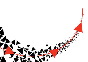
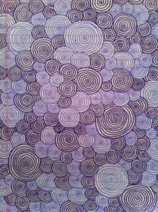
Rythem
“Rythem occurs when an object has varying distances between several frequencies.” It is also a way that different shapes are put together to make a pattern that makes sense for our eyes to look at. Rythem in art and design helps viewers make sense of the work and really take in what the artist was trying to capture within the design they are trying to create.

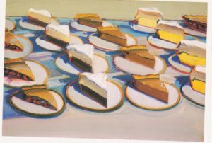
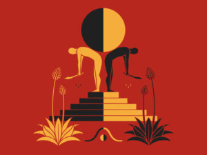
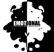
Balance
“Balance in any composition occurs when all objects in it have visual equilibrium.” For me personally, when I look at a really complicated piece of design, it bothers me. For me to be able to enjoy a piece, there needs to be symmetry and or balance. There needs to be an even amount of anything on the canvas or design. If something is happening on one side, it needs to happen on the other. Balance creates a peaceful look on designs and helps well balance out the artwork.
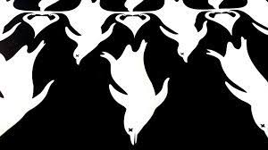
White Space
“White space is a space in any design. It is also known as negative space.” I love looking at these black and white designs that your eye catches a certain color to find the art, and then you take a second glance at it, and you look harder for the other space that your eyes didn’t immediately snap to and see if there is a shape or design that you missed. These designs that involve white space are so intriguing to design and come up with. You can try and make an obvious design, or you can design something complex and that viewers have to look hard at to understand.
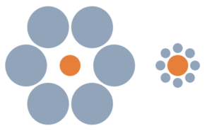
Portion and Scale
“Portion is the relationship between objects with references to the size and visual weight.” Different designs that involve scale and portion are hard to enjoy, in my opinion, unless it is done right. For a piece to have a good scale and portion, there has to be a clear visible difference, not like a small circle being compared to another circle with a little bit more circumference. There must be an obvious difference in both objects, like comparing a coin to a tall building.

Gestalts Theory
The overall theory is the understanding of how we comprehend pieces of art. Humans tend to try and simplify things, like a chaotic piece of artwork. Our brain will try to make it more simple and easier to look at. I am the same way. If something is messy or there is a lot of change in a short period of time, my brain tells me to do something about it; it tells me to clean up whatever I’m looking at. Our brains try and also group things to make designs easier to understand. I found myself agreeing with this theory the more I read and the more I read, the more I understood what I do when I see something messy or chaotic, and it doesn’t even have to be artwork or a design. It could be my room or an incorrectly written sentence. I liked reading these two links about the Gestalt Theory and how psychological art really is.