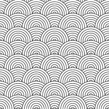
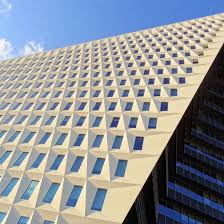
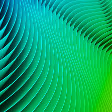
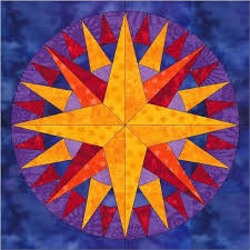
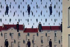
Repetition:
Repetition is something that is being repeated over and over again. In the design world this may mean that the formatting shows repetition or that the same thing like a line is being repeated over and over again to make something, that is repetition. To me repetition it something I always like to have in anything that I’m doing because I think it looks cleaner. When something has repetition I believe it looks better than something that doesn’t have it. I tend to look at the layout of something before reading it and if it looks clean and neat it is much more appealing.
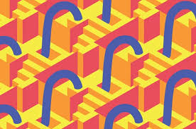
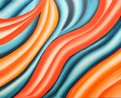
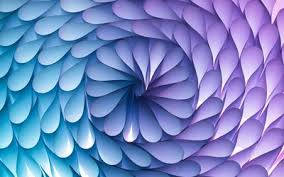
Rhythm:
Rhythm is varying distance between several frequencies. It can also be the arrangement of of shapes that are put together in an underlying way that makes a beat. When I think in rhythm in art I think of how two silk sheets move and look when they are pulled against each other. I think if it this way because it is a beautiful thing to observe and it is very clean and seamless. It is very similar to music but instead of notes we use shapes and colors to create rhythm.
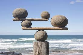
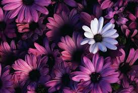
Balance:
Balance is when different elements are equal or in the correct proportions. Balance is the distribution of colors, shapes, objects, and textures to make the piece look best. I like when things are symmetrical because it is appealing to the eye. When things are balanced they are more beautiful in my opinion. I like how everything is even on both sides to make apiece come together.
White Space:
White space can make or break a piece. There can never be too much white space. White space is also know as the empty space in a piece. If you don’t have enough white space then it will look cluttered and messy. I like how white space looks when it is also balanced throughout the piece. White space also helps us break up space when looking at something and when you break up space is is much easier to see what the piece is.

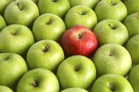
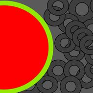
Contrast:
Contrast is the state of being strikingly different from something else in association. I like contrast because it can draw attention to a certain detail. It can also make something pop in a piece and can draw the viewers eye. With contrast you can make the viewer look at what you wan them to look out. You can make this happen by using different colors, shapes, and even textures.
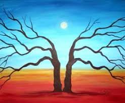
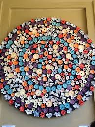
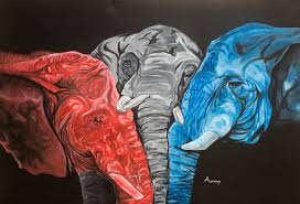
Unity:
Unity is a visual similarity between different elements in a composition. It can also refer to how different elements of artwork or design works can come together and create wholeness. When different elements come together to make one thing it can look very interesting and can be very appealing to the eye.
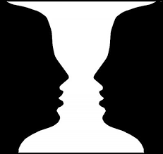
Gestalt Theory:
The Gestalt Theory overall is based on the idea that the human brain will attempt to organize and simplify complex images or ideas. Humans do this because they do not like to look at things that are messy. After reading the two articles I can understand how much I agree with the Gestalt theory because I like things that are organized and easy to look at. It also helped me realized how much art is psychological as much as is it creativity. Our brains tend to see art differently than the artist may have wanted, and that is the beauty of art. This theory shows art as simple but then as you look at it more it begins to get more complex as your brain comprehends it. Overall I really enjoyed reading about the Gestalt Theory.