The Gestalt Theory
When reading about the Gestalt Theory, I learned that we try to make connections and relate objects together so we can put them ‘together’ as one. By looking for things that are simple and similar, or common and closed, our brains naturally try to fill in the extra from what we are given. My favorite element would be closure because you try to make more shapes and designs from the letters and shapes provided.
The Graphic Design Principles
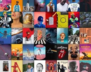
On a Mac you’re able to have all of your music albumspopup when you don’t touch your computer for a while. I believe this shows a good representation of variety. Even though a designer may not put together every single arrangement on everyone’s computers, I chose to use this as an example because it’s custom to each individual user. Every time this does pop up, it’s full artists that you enjoy and prefer with a good variation of all your different styles.
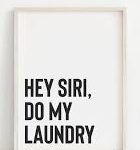
In this image white space is used to help draw the readers eye, yet also making the poster simple and easy to read. Personally I don’t quite like white space that much, unless its got some color to it like a yellow poster with a few bold words in the corner. Still eye catching, gets the message across, and is to the point.
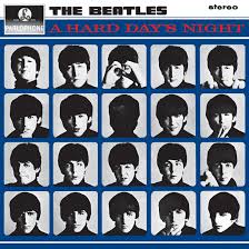
Balance is one of my favorite principles of Graphic Design. There’s something very satisfying about having everything lined up all spaced out and even. In my example I have The Beatles: A Hard Day’s Night album cover. It has almost a grid layout with showing the artists’ images laid out where each one is very similar in style and really only changes in their pose.
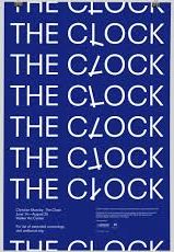
I see a lot of repetition when it comes to book covers, posters, and now even on albums. My favorite part about this principle is when they use repetition to make a pattern with words. I found this book cover that uses repetition and even plays with the letters a bit to create a clock. This form of design can be done very sleek and simple, or even creative and complex, yet both catch the audience’s eye.
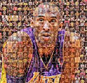
With this example of Unity I found, it’s many small photos of Kobe Bryant arranged and put together to form on large photo of him. I’m not crazy for this principle of design compared to the rest, but some of the work that comes out of it (like this photo) amazes me.
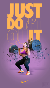
Emphasis is a very easy way to take your design a step farther. With this Nike Just Do It poster, the creator was able to take a quote and add in the Nike slogan into it. I enjoy how you’re able to do so by switching colors, fonts, orientation, and so many other ways.