Repetition
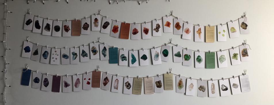
crystal cards on my dorm wall
Repetition is seen everywhere in life. For example, it is seen in the windows of the Redfern, where each window is a designated width and height, and each is a designated width apart. It is also shown in the cards on my wall, though admittedly, they’ve gotten a bit crooked over time.
Asymmetrical Design & Balance
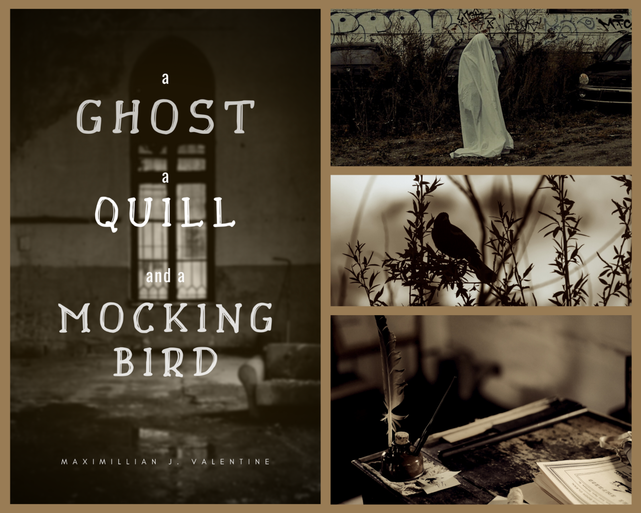
a moodboard representing my work
I used a balanced asymmetrical design in my introduction post for my site to draw attention to different spots in the piece and provide visual information on what the story symbolizes. By adding asymmetry, the image stands out, and by making each side have equal visual weight, it feels purposeful and balanced. Once again, the windows of the Redfern can show asymmetrical design because the panes are divided to have a smaller piece at the top and a larger piece at the bottom; the two panes are the same width, which provides balance and makes the design purposeful.
White Space & Emphasis
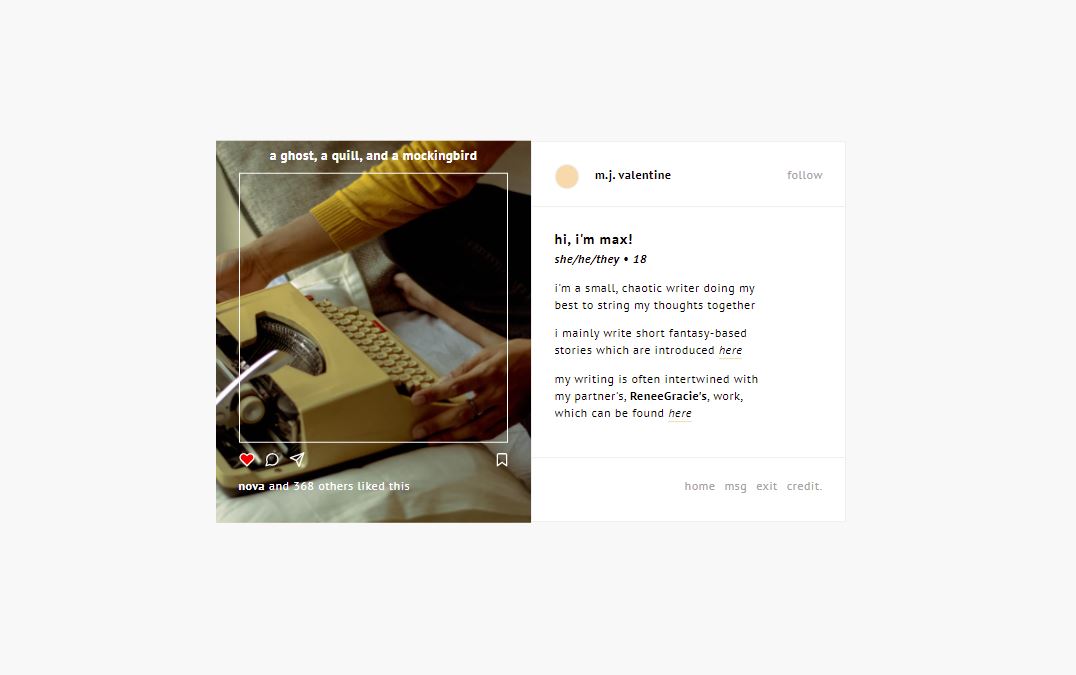
my about page
I use white space in my about page to create minimalism and emphasize the information provided. White space is also used in a lot of dorm decoration; to create contrast between spaces, to create a feeling of openness, or simply because we are limited in what we can actually attach to our walls.
Contrast
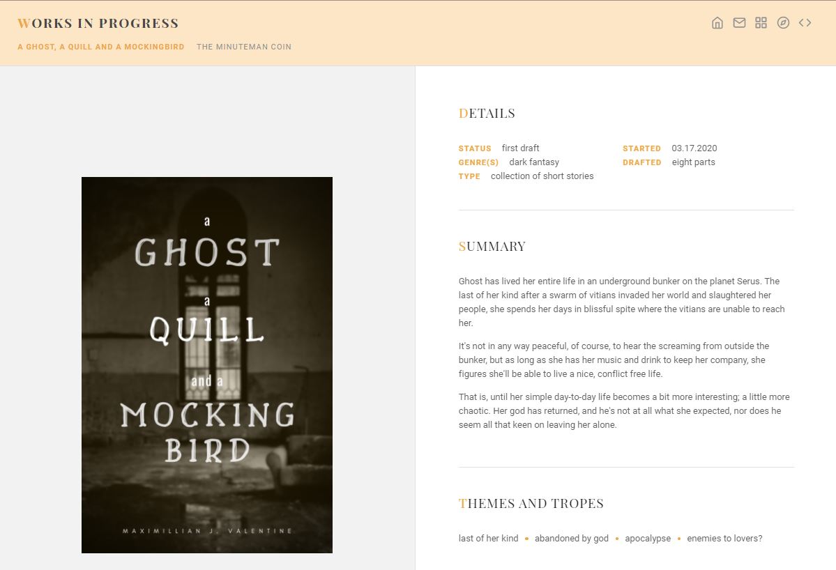
my wip page
I use contrast in displaying my work to draw the eye to important statistics, such as the genre and type of my work. It is also used on the cover on the left side to draw attention to the title. Contrast is often used to draw the eye to important information or to the design in general. It is seen on signs such as stop signs as well as billboard ads and book covers.
Variety
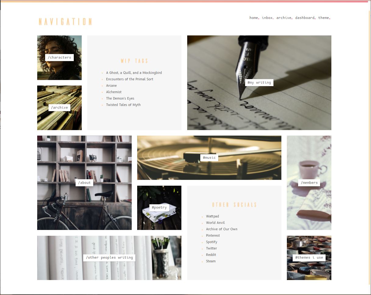
my navigation page
Rather than having a straightforward navigation page, I chose to create variety using images and unique containers. I created two unique sections, ‘WIP Tags’ and ‘Other Socials’, to draw attention to what I wanted the visitor to look at the most. I also created variety within the image containers to represent the purpose of each container link.
Gestalt Psychology
As a psych major, this theory ties both interests together. The theory makes use of the part of the brain that works with form identification and facial recognition; by putting details together, we are able to recognize a person, an object, or see things in images that may not be there. The human mind is drawn to faces, and as such, we see faces in everyday objects such as trees and patterns.
By working with simplicity, figure-ground, proximity, etc., and the psychology behind how our minds perceive the world, graphic designers are able to almost manipulate our minds into recognizing what they want us to recognize or attend to what they have drawn attention to. That isn’t to say we are being manipulated by ‘mind-altering waves’ or that graphic designers have negative intentions; it’s simply a more in-depth study of what we as humans innately understand about ourselves and each other. After all, many of us tend to adhere to the same rules without knowing the words or purpose, such as when a person organizes their books or hangs a painting on a wall.