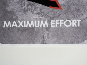
My bad kerning example is a poster in my room the says “Maximum Effort .” The reason why I think that this is a bad kerning example is that at the base in maximum, the “A” touches the “M” and the “X”. This is a problem because none of the other letters touch at the base in either of the words. To go along with that issue, both words feel too tight and too close together; this is seen between the “F” and the “O” in “EFFORT.”