When reading these chapters, I got to learn a lot about the different eras of Graphic design. For me personally, it was mind-blowing to see how graphic design has progressed so much throughout the years. Also, it was cool to see how far back graphic design has been around for. Graphic design has gone through many changes over the course of eras. The eras that I read about are designing utopia, ideological dependents and the new typography, a turn of the century response to industrialization, and moving towards a modern sensibility.
Designing Utopia
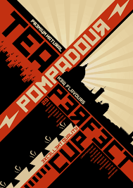
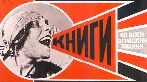
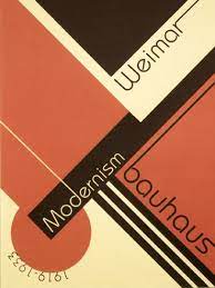
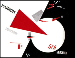
One time period in graphic design that I found interesting was the Designing utopia era, which was at the end of World War 1. During this era, artists felt this new purpose in their art; they felt the need to have their art having meaning to it. This led to the idea of Constructivism, which was art that was centered around a collective style instead of a personal style. Constructivism explored the ideas of space, movement, and materials. Art in this era tended to be bold, as its goal was to stand out to people and spread a message. It incorporated different types of bold fonts and colors. A movement formed from this era was called De Stijl, which was from 1917-1931. This movement was known for having straight lines, right angles, and primary colors, which inspired designs in many different areas including architecture. I enjoyed reading about this era because it was interesting to see the meaning and story behind the propaganda used during that time period. I did not know that the purpose of art back then was to have a more collective style to influence the people. It was cool to discover how art had different meanings to the different eras.
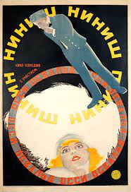
Graphic Design ideas from the Russian Revolution
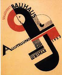
Ideological Dependents and the New Typography
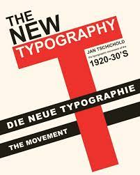
Another section that stood out to me while reading was about the ideological dependents and the new typography. This era was inspired by the constructivism era because many of these newfound typefaces were inspired by propaganda posters. An artist named Jan Tschihold introduced more simplistic typefaces. The gothic script was widely used at the time, but he wanted to incorporate a modern twist on it. This led to the idea of new typography, which had asymmetrical approaches and used san serifs without ornaments. Another artist, Piet Zwart, used varying sizes and styles of typefaces that overlapped each other. I like reading about typefaces because of the numerous ways that typefaces can be used. I never considered how artists use varying shapes in sizes in their work to create a different look. Even though that letters may seem simple and basic, I learned that there are numerous ways to use them in art.
New Typography with Tschichold

A Turn of the Century Response to Industrialization
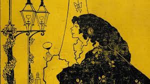
A turn of the century response to industrialization was fascinating for me to read about. This era was one of my favorites to read about because I feel that this era of art was filled with many different types of art. The Gothic revival was first formed during this time in the 1800’s, which involved the idea of pointed arches; the Brooklyn Bridge designed during this time was inspired by these ideas. The aestheticism movement was shortly followed, which explored the concept of removing art from the industry and focusing it on the idea of art and life. Art involving birds, flowers, and vines (called woodblock prints) was developed by inspiration from Japan. This type of art incorporated high contrast shapes and patterns. This era was so interesting for me to read about because it was cool to see what type of art was popular during this time period so long ago, and how so many art forms back then are still incorporated in art today.
Moving Towards a Modern Sensibility
This era was the shift to focus on more modern art in the early 1900’s. Modern art started with the basis of abstraction, which was the process of distilling information into its basic form. This involved lines, form, and colors. Modernism was also formed, which expressed abstract art mixed with practicality and purpose. Abstract art is one of my favorite categories of art, so this was cool to see how it all started. Modernism was used a lot in architecture; they used lots of geometry and linear patterns in buildings and interior designs. Artist Peter Behrens mixed abstract architecture and industrial designs in his work. He made his own typeface in his art that would incorporate lots of shapes and lines to help create an abstract look. This was fascinating to read about because I feel that abstract art was completely different from what it could be considered now. It is cool to see how much art has changed over the years, and what can be considered abstract art now was very different back then.
In conclusion, I have learned so much from reading these chapters. Reading about these four different eras of art was eye-opening to see how much art has changed over the years. From designing utopia which was an era that involved art that had meaning and had bold colors and fonts that stand out, the ideological dependents and the new typography that explored the different kinds of typefaces, a turn of the century response to industrialization that incorporated art focus on life forms, and moving towards a modern sensibility which first explored the idea of abstract art, there is such an endless variety of the type of art that can be made. Reading this chapter showed me how much graphic design has progressed through the years, and even though the meaning behind art may be different now, the ideas and techniques used are still incorporated in our graphic design today.