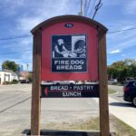
Basic Info
79 Emerald Street
Keene, NH
Email: firedogbreads@gmail.com (no phone #)
Description and Context
Owner Sam Temple was a French historian/history professor in Oklahoma with his partner, Bridget Love, a Japanese anthropologist. The pair baked as a hobby in their garage on weekends, but eventually decided to leave academics and move away. They started at farmers markets here in Keene, then opened up the bakery late in 2019.
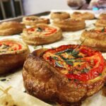
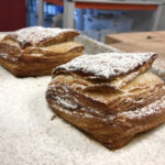
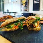
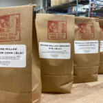
They currently offer different breads each day of the week, European style pastries, sandwiches, and coffee. Having classes and workshops for teaching the bread making process was also very important to them, you can see a list of class offerings on their site.
A baking podcast, Rise Up! Also did an interview with Sam Temple in July 2020. I learned from the description that New Hampshire is originally where Temple is from. The podcast is over an hour long, with the two discussing the challenges and strategies for opening a bakery. I also discovered that they opened the bakery around the beginning of 2019. Temple did talk a bit about wholesale (selling large batches to retail locations like restaurants and stores) versus in store retail (customers buying small amounts of the product directly). He said both were important to him for Fire Dog Breads, but at the time of this interview, they end up doing much more retail than wholesale.
Gut Feelings
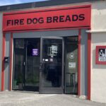
I had never been to, nor had I ever heard of this place before now. When I first opened up the site, I felt surprised by the logo and theme they chose. I would say the design vibes would be more fitting for a brick oven pizza place or even a tattoo parlor. This wasn’t necessarily a bad thing, but it was certainly unexpected.
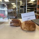
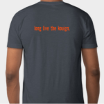
I made a plan to visit with my roommates, and we soon discovered that we had to order online in advance or we would not be getting any bread or pastries. While we were there, people that simply strolled in and wanted something were turned away because the place had sold out. The interior was small with an open kitchen behind a little glass-walled counter. The counter was essentially empty, I don’t know if we just caught them on a busy day, but it felt very barren. There were a few odd swag t-shirts hanging on a wall alongside some seemingly random art prints. The menu was a tiny whiteboard with typed slips of paper stuck to it. I could see that fitting a certain aesthetic, but it didn’t fit whatever was happening there.
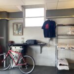
The bakery wasn’t dead in terms of business, though. Customers were sitting in and chatting, walking in and out as we ate our little pastries. We watched the small team scurry around in the open kitchen, and we even saw a delivery boy come back on his bike. The food was a little pricey, which is to be expected from a local business dealing with inflation. But, it was incredibly delicious and the whole place smelled heavenly.
So, overall, a wholesome and busy place with quality food, but struggles regarding supply/demand and disorganization seem to shine through. The identity of this business feels a little off center, almost like they were trying to be unique with the black and red, grungy style, but didn’t quite hit the mark, so now it just feels awkward.
Visual Interest Pages
Main Site
Ordering Site
Bread Calendar
Classes
Photographs of the building and interior, signage, products, etc

Printed Materials
There really wasn’t anything like this inside, all of their info is on the site. The menu is digital, and there’s a tiny whiteboard indoors.
Thirty descriptive words
Passionate, natural, hardy, rustic, unique, tenacious, nutty, organic, wholesome, fresh, homely, warm, fire, limited, scarce, fast, frantic, small, barren, dingy, bustling, hidden, quaint, pricey, traditional, awkward, grunge, energetic, early-bird, friendly.
Gallery of logos, graphics, T-shirts, photos of swag, ads, etc

Competitors
Brewbakers, The Bread Shed, The Works, Panera
Target Audience
Definitely adults, seeing how none of the pastries, bread, and lunch foods have child oriented pallets. There’s nothing super sweet like cupcakes, and even their grilled cheese has kimchi in it. You really have to look for it to find it, my roommates and I had a hard time walking to it at first. Plus their hours are very limited, and the interior isn’t a very good “hang out” spot to drink, like a cafe might have. So I feel like this place is for early birds that like to grab and go, again, probably older adults. I don’t feel like Fire Dog is catered towards a particular gender or occupation, though. The quality and unique french style of the pastries may attract foodies or those versed in baking.
Purpose of Redesign
From what I gathered, Fire Dog Breads wants to provide people of all ages with natural, good food. They have the flavor down, and the site got me excited to try their products, but the identity feels a little distant and out of place. Surprised and a little confused isn’t really the feelings I would want to have about a bakery when seeing their logo for the first time. The identity doesn’t go further than the site, the sign, and some t-shirts.
They do update their instagram often, but they’re definitely not doing enough outreach. No one I’ve talked to has ever heard of this place. And, if you do happen to stumble upon the store, it’d be difficult to just buy a pastry without preordering. I feel like they could hone in on the, “order online, we’re so good it sells out instantly!” kind of marketing tactic. The colors and vibe of the site/logos could change too, it feels way too dark and gritty. When I first heard the name, Fire Dog Breads, I thought of something cute, but then I got hit with a medieval, humanoid dalmation and a scary looking hound in black and red. If they really wanted to go for the darker, stone-pizza-house vibe they should push it differently.